Tutorial Introduction
Goals
This tutorial will pick up from the previous one. We will talk about:
- Visualizing one numeric predictor (on the x axis) with one categorical predictor (in color)
- Reviewing the application of a “simple” model (using just one predictor)
- Creating and interpreting an “additive” model
- Creating and an interpreting an “interaction” model
Visualizing Two Predictors
A simple model
So far, we’ve only considered how we can predict the value of a response variable using one numeric predictor variable.
ggplot(data = penguins, aes(x = bill_depth_mm, y = bill_length_mm)) +
  geom_point() +
  labs(y = "Bill Length (mm)", x = "Bill Depth (g)") +
  geom_smooth(method = "lm", se = FALSE)
## `geom_smooth()` using formula = 'y ~ x'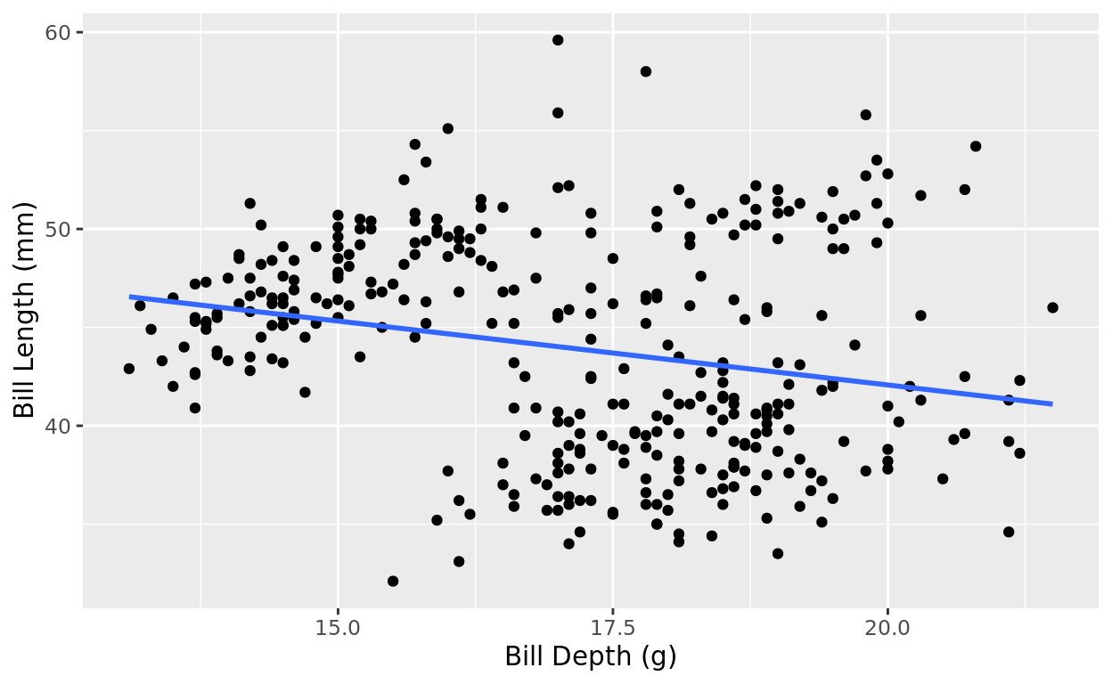
Add a categorical variable
But we might gain more predictive power by including a second predictor! In the example above, what if we used both the bill depth of a penguin and the penguin’s species to predict it’s bill length?
ggplot(data = penguins, aes(x = bill_depth_mm, y = bill_length_mm, color = species)) +
  geom_point() +
  labs(y = "Bill Length (mm)", x = "Bill Depth (g)") +
  geom_smooth(method = "lm", se = FALSE)
## `geom_smooth()` using formula = 'y ~ x'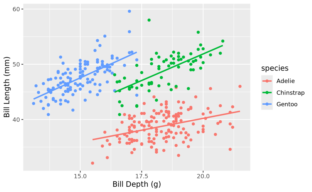
What did we find?
That categorical predictor completely changes the story. It looked at first like higher bill depth suggested lower bill length on average. But that’s just because species is a confounder here.
We actually see a positive correlation if we stratify the data by species.
Modeling Options
Let’s say we have one numeric predictor (e.g., bill depth) and one categorical predictor (e.g., species). Here our the modeling options!
A Simple Model: We choose only one of these predictors to include in the model.
An Additive Model: We plot a simple relationship with the numeric predictor, but give each group in our categorical variable a unique intercept.
An Interaction Model: We allow each group of our categorical variable to have a unique intercept and slope! The relationship (slope) between the numeric predictor and our response depends on which group we are looking at.
A Guiding Example
Prompt
Let’s consider a (made-up) experiment: Participants were asked to take a test on a topic that was unfamiliar to them. The response variable is their score on that exam. However, we have two variables we’re going to use to predict their test score
- How much
study_timethey spent (in minutes) - Which study
materialsthey were given (Clear or Unclear)
Let’s say the “Clear” study materials were carefully structured to benefit students more, whereas the “Unclear” instructions were full of jargon and not very accessible for learning.
Visualize the data
Let’s take a look at this data, with study time on the x-axis, and coloring by which materials they were using.
#Create the data
Task_Data
#Plot the Data
ggplot(data = Task_Data, aes(x = study_time, y = score, color = materials)) +
geom_point() +
labs(x = "Study Time (min)", y = "Exam Score")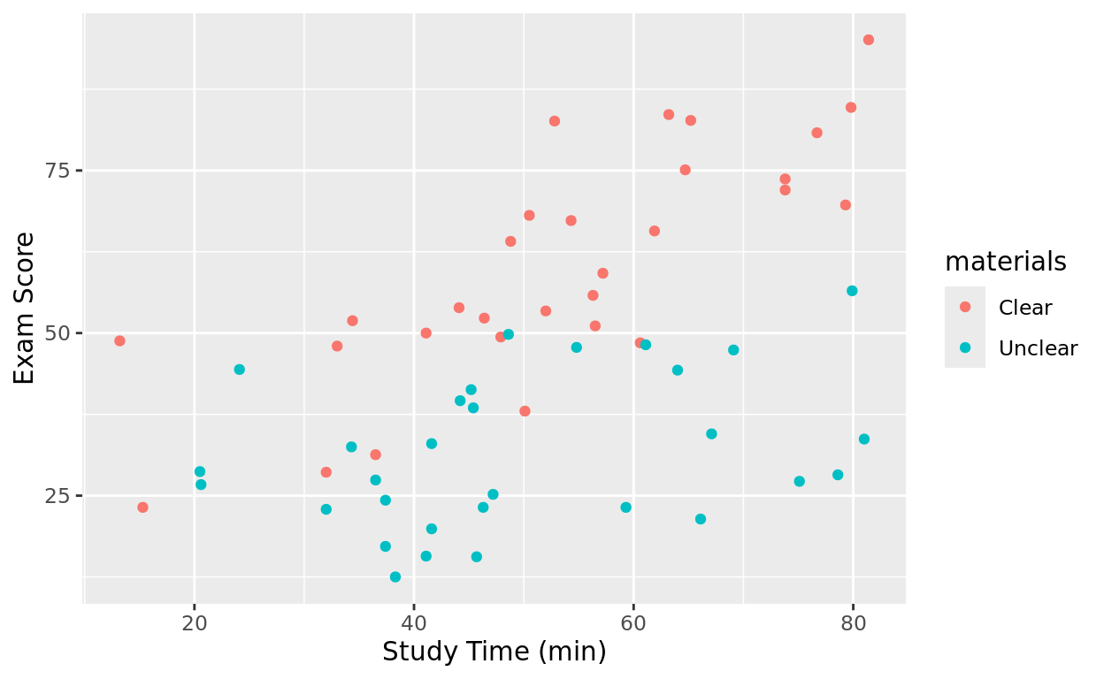
What’s next
Let’s explore some modeling options for these groups!
- First we will look at the simple modeling options (each predictor in isolation)
- Next, we will look at an additive model
- Finally, we will check an interaction model
Example of Simple Models
Study Time in Isolation
We can start by using study time as the sole predictor of exam score.
Notice: If I still want to retain materials in color, I will need to select a specific color in geom_smooth so that it knows I want only one line.
ggplot(data = Task_Data, aes(x = study_time, y = score, color = materials)) +
  geom_point() +
  labs(x = "Study Time (min)", y = "Exam Score") +
  geom_smooth(method = "lm", se = FALSE, color = "black")
## `geom_smooth()` using formula = 'y ~ x'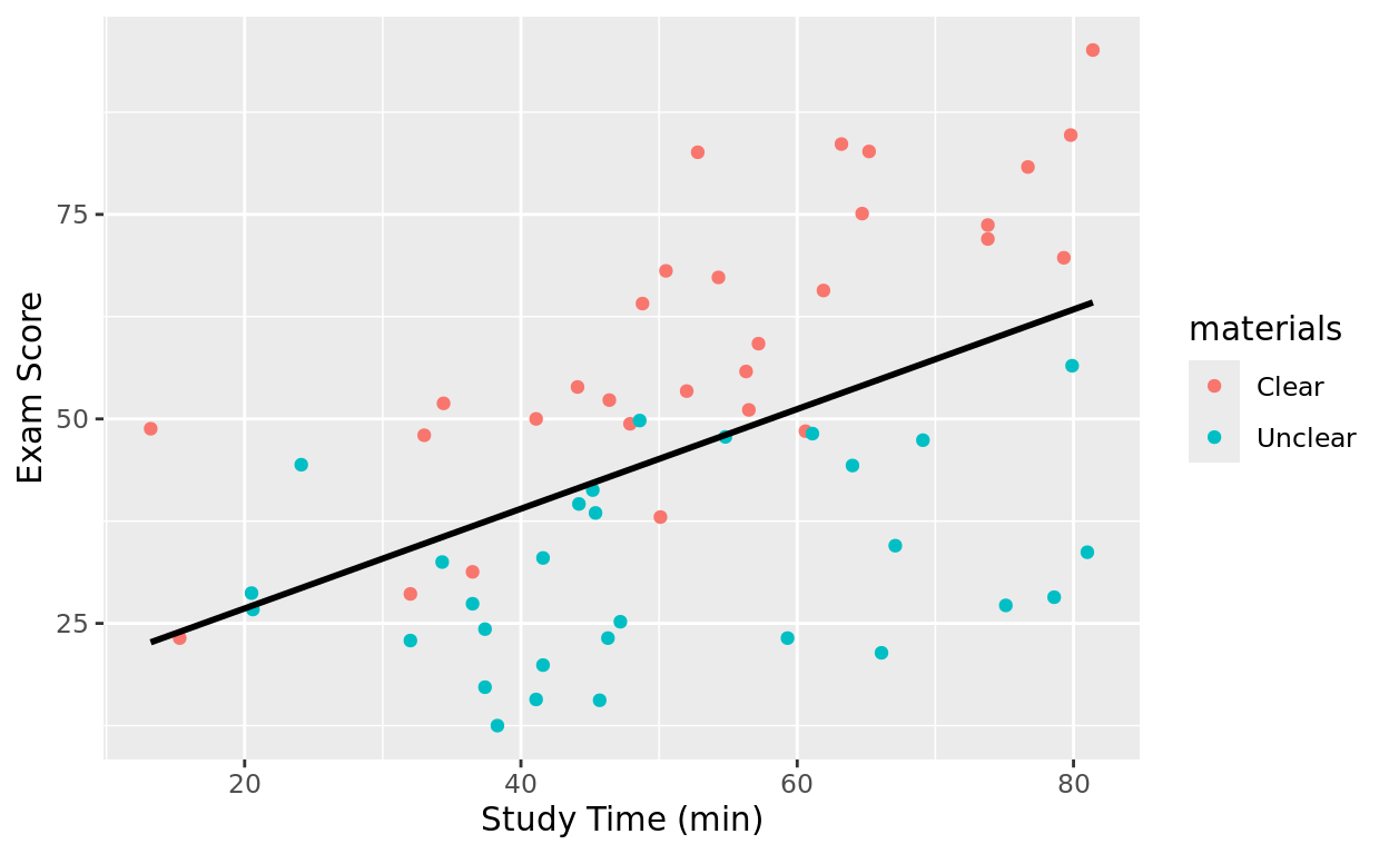
Linear Model with Study Time only
As we learned in a previous tutorial, we can make a simple linear model to find a best fitting line and judge how much predictive power we find with this predictor.
mod_simple_ST = lm(data = Task_Data, score ~ study_time)
summary(mod_simple_ST)
##
## Call:
## lm(formula = score ~ study_time, data = Task_Data)
##
## Residuals:
## Min 1Q Median 3Q Max
## -34.333 -9.922 -0.630 13.273 35.786
##
## Coefficients:
## Estimate Std. Error t value Pr(>|t|)
## (Intercept) 14.6439 7.3345 1.997 0.0506 .
## study_time 0.6093 0.1352 4.507 3.24e-05 ***
## ---
## Signif. codes: 0 '***' 0.001 '**' 0.01 '*' 0.05 '.' 0.1 ' ' 1
##
## Residual standard error: 18.05 on 58 degrees of freedom
## Multiple R-squared: 0.2594, Adjusted R-squared: 0.2466
## F-statistic: 20.32 on 1 and 58 DF, p-value: 3.24e-05We find:
- From our Estimate column, the best fitting line is \(\hat{y} = 14.6439 + 0.6093\)(
study_time) - We have an \(r^2\) value of 0.2594, which after adjusting for correlation likely due to random chance, comes to 0.2466
- From the p-value 0.0000324, we have very strong evidence that there is at least some linear relationship between study time and exam score
Instruction type only
What about the simple relationship between the materials a person used and their exam score? In other words, we are now going to ignore study time and just look at average exam score differences between each group.
ggplot(data = Task_Data, aes(x = materials, y = score, color = materials)) +
  geom_jitter(width = 0.05) +
  labs(x = "Clear vs. Unclear Instructions", y = "Exam Score")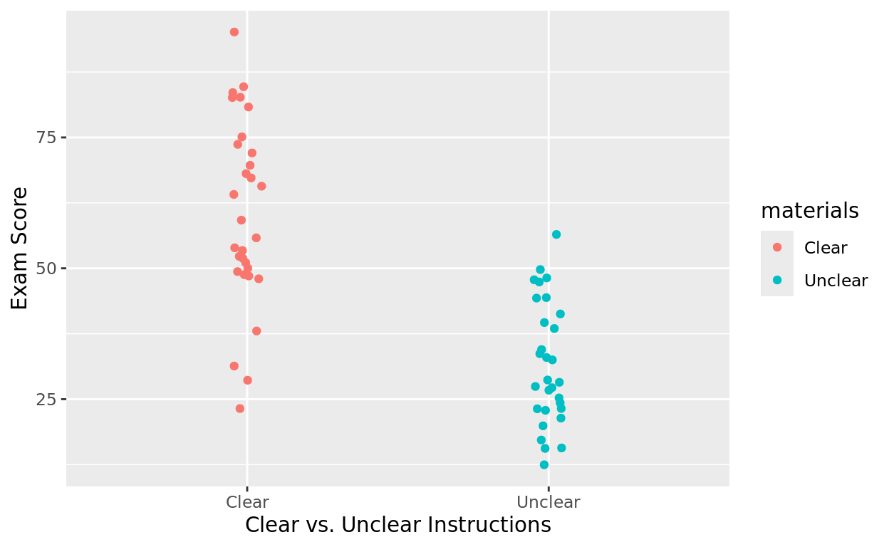
“Linear Model” with Group only
It may be weird to think of fitting a “linear model” across two columns. All that means here is that we’re connecting the mean of one column with the mean of the other with a line.
To run this as a linear model, R will treat the category options as 0’s and 1’s. By default, it will do it alphabetically:
- The alphabetically first group name (Clear) will now behave like 0’s in the column
- The other (Unclear) will be 1’s in the column.
Just for sake of this tutorial… this is how R is thinking about this “linear” relationship.
Task_Data$binary = ifelse(Task_Data$materials == "Clear", 0, 1)

ggplot(data = Task_Data, aes(x = binary, y = score)) +
  geom_point() +
  labs(x = "Clear vs. Unclear Instructions", y = "Exam Score") +
  geom_smooth(method = "lm", se = FALSE) +
  scale_x_continuous(limits = c(0,1), breaks = seq(0,1,1)) +
  scale_y_continuous(breaks = seq(10,100,10))
## `geom_smooth()` using formula = 'y ~ x'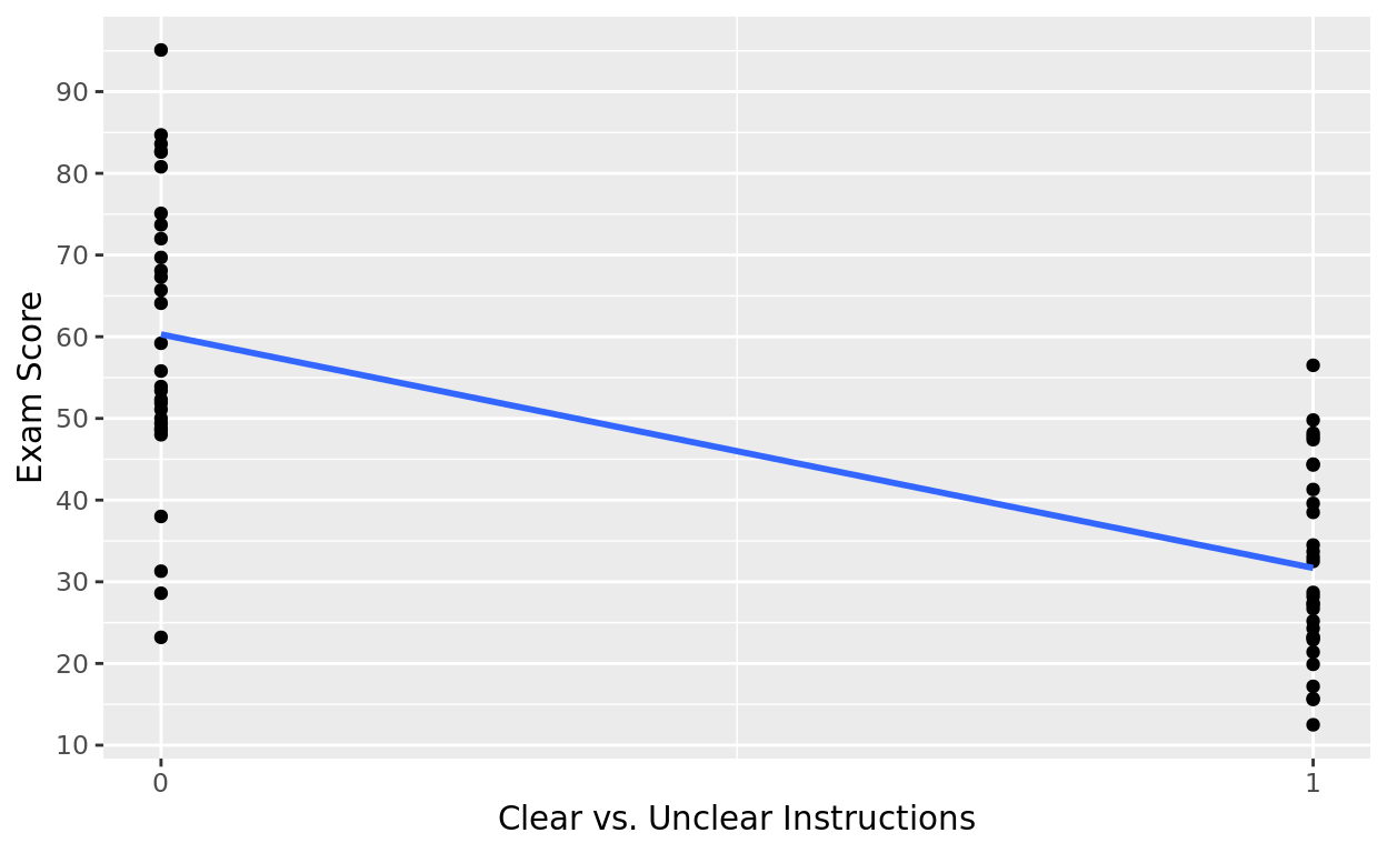
Linear Model Output with Group
mod_simple_group = lm(data = Task_Data, score ~ materials)
summary(mod_simple_group)
##
## Call:
## lm(formula = score ~ materials, data = Task_Data)
##
## Residuals:
## Min 1Q Median 3Q Max
## -37.087 -9.462 -3.243 11.937 34.813
##
## Coefficients:
## Estimate Std. Error t value Pr(>|t|)
## (Intercept) 60.287 2.759 21.854 < 2e-16 ***
## materialsUnclear -28.593 3.901 -7.329 8.2e-10 ***
## ---
## Signif. codes: 0 '***' 0.001 '**' 0.01 '*' 0.05 '.' 0.1 ' ' 1
##
## Residual standard error: 15.11 on 58 degrees of freedom
## Multiple R-squared: 0.4808, Adjusted R-squared: 0.4719
## F-statistic: 53.72 on 1 and 58 DF, p-value: 8.199e-10From the output, we find:
- The Intercept is 60.827. This is the mean score of the base group (Clear).
- The slope is -28.593. This is how much different the mean score is for the other group (Unclear) with respect to the baseline group
This means that the mean score for those with Clear instructions was 60.827, while the mean score for those with Unclear instrucions was 60.827 - 28.593 = 32.234.
The \(r^2\) and adj. \(r^2\) also show that this one grouping difference alone explains almost half of the variability in exam score!
Example of Additive Model
Visualizing an Additive Model
An additive model will:
- Have only one slope–the relationship between study time and score
- Create a unique intercept for each materials group–materials now contribute a constant additive difference.
FYI plotting an additive model is a little complicated. You do not need to know how to write this code on your own to visualize. We’re just visualizing for sake of learning it.
add_mod = lm(data = Task_Data, score ~ study_time + materials)
Task_Data$prediction = predict(add_mod)

ggplot(data = Task_Data, aes(x = study_time, y = score, color = materials)) +
  geom_point() +
  geom_line(aes(y = prediction), size = 1)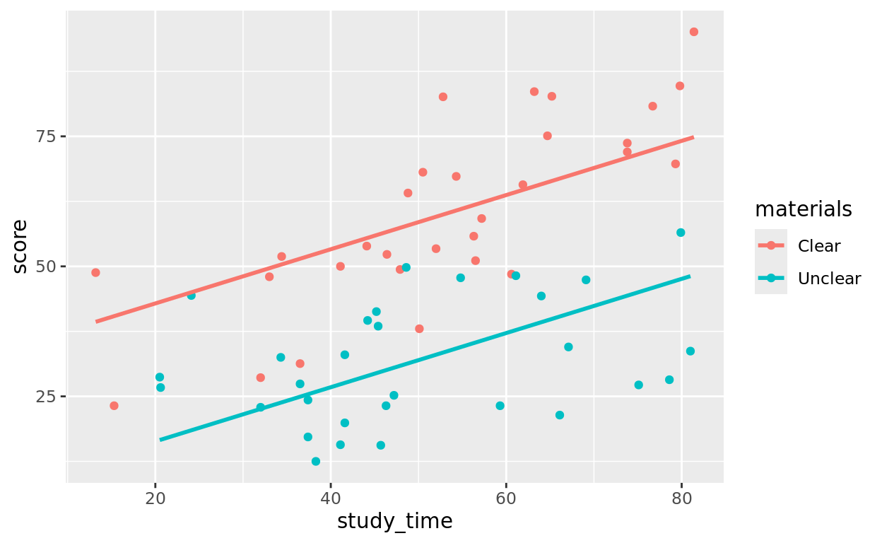
Modeling an Additive Model
To make an additive model, we just add both predictors on the right side of our ~ symbol, combined with a + sign.
add_mod = lm(data = Task_Data, score ~ study_time + materials)
summary(add_mod)
##
## Call:
## lm(formula = score ~ study_time + materials, data = Task_Data)
##
## Residuals:
## Min 1Q Median 3Q Max
## -20.5537 -8.0572 0.6533 9.0508 25.9224
##
## Coefficients:
## Estimate Std. Error t value Pr(>|t|)
## (Intercept) 32.45560 5.39121 6.020 1.33e-07 ***
## study_time 0.52092 0.09191 5.668 5.00e-07 ***
## materialsUnclear -26.53222 3.16816 -8.375 1.65e-11 ***
## ---
## Signif. codes: 0 '***' 0.001 '**' 0.01 '*' 0.05 '.' 0.1 ' ' 1
##
## Residual standard error: 12.19 on 57 degrees of freedom
## Multiple R-squared: 0.668, Adjusted R-squared: 0.6563
## F-statistic: 57.33 on 2 and 57 DF, p-value: 2.259e-14What do we find from the Estimate column?
- The intercept term represents the intercept for our baseline category (Clear)
- We have a common slope for both groups. That is, for every one unit increase in study time, we expect a 0.52 point increase in exam score on average.
- The “intercept adjustment” for the Unclear group is -26.5322. That means we take our prediction for the clear group, and just adjust it down 26.5 units.
You can think of this model as giving us two lines of best fit.
- For the Clear group: \(\hat{y} = 32.4556 + 0.52092\)(
study_time) - For the Unclear group: \(\hat{y} = 5.92338 + 0.52092\)(
study_time)
Interpreting the Strength of this Model
Notice that adj. \(r^2\) for this model is 0.6563. That’s improvement over either simple model option!
We can also look at the p-value for our two predictors to see that each are uniquely contributing.
- The p-value for
study_timeis testing whether we have evidence that study time has some linear relationship after already accounting for group. - The low p-value (0.0000005) provides very strong evidence it is!
- The p-value for
groupis testing whether we have evidence that the intercept adjustment is different from 0 after already accounting for study time. - The low p-value (0.0000000000165) provides very strong evidence it is!
Example of Interaction Model
When we talk about two predictors “interacting,” we mean that the relationship that one has with the response depends on the value of the other!
What does that mean in our context?
An interaction means that the relationship (slope) between study time and exam score depends on which set of instructions they had.
It makes sense that the more time people studied, the better (on average) they scored. It also makes sense that those with clearer instructions probably saw more benefit from study time (steeper relationship) than those with unclear instructions (flatter relationship).
Visualizing an Interaction Model
This is pretty straightforward to visualize! Just color your grouping variable and add geom_smooth. If you leave the color option out in geom_smooth, it will create a separate line of best fit for each group.
ggplot(data = Task_Data, aes(x = study_time, y = score, color = materials)) +
  geom_point() +
  geom_smooth(method = "lm", se = FALSE)
## `geom_smooth()` using formula = 'y ~ x'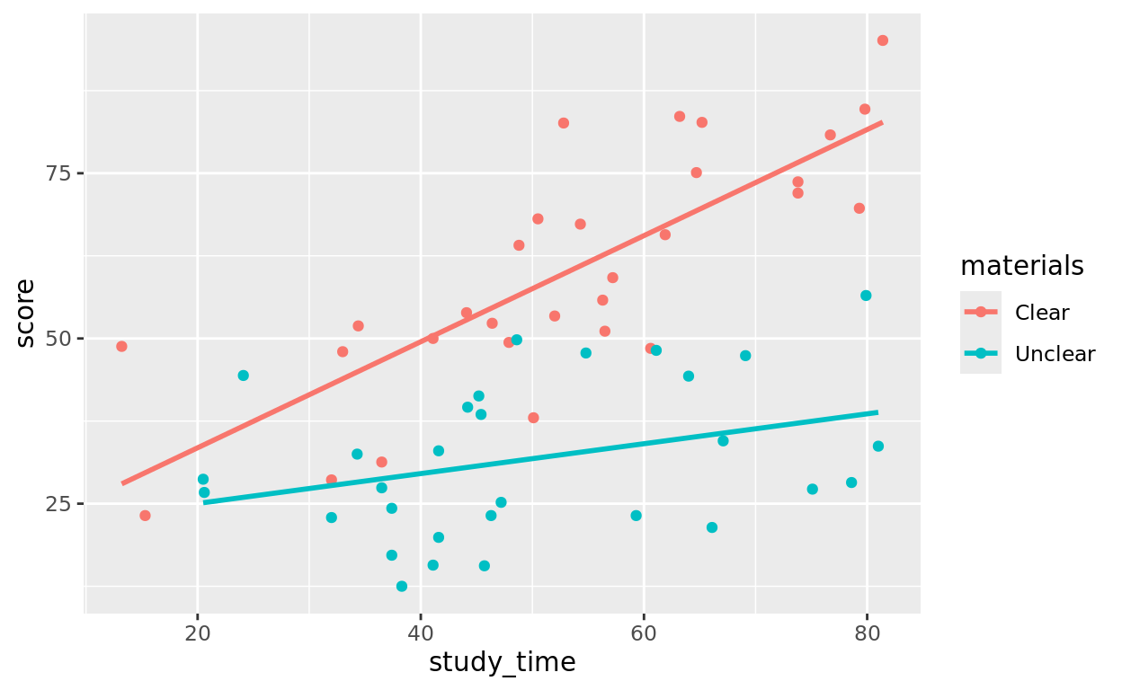
Modeling an Interaction Model
To make an interaction term, use the * sign to connect the predictor variables which you want to allow interaction.
int_mod = lm(data = Task_Data, score ~ study_time * materials)
summary(int_mod)
##
## Call:
## lm(formula = score ~ study_time * materials, data = Task_Data)
##
## Residuals:
## Min 1Q Median 3Q Max
## -19.617 -8.336 -1.270 8.069 22.816
##
## Coefficients:
## Estimate Std. Error t value Pr(>|t|)
## (Intercept) 17.4060 6.6242 2.628 0.01107 *
## study_time 0.8026 0.1179 6.805 7.27e-09 ***
## materialsUnclear 3.1062 9.1483 0.340 0.73548
## study_time:materialsUnclear -0.5766 0.1687 -3.417 0.00119 **
## ---
## Signif. codes: 0 '***' 0.001 '**' 0.01 '*' 0.05 '.' 0.1 ' ' 1
##
## Residual standard error: 11.19 on 56 degrees of freedom
## Multiple R-squared: 0.7252, Adjusted R-squared: 0.7105
## F-statistic: 49.27 on 3 and 56 DF, p-value: 1.013e-15Findings
What do we find from the Estimate column?
- The intercept term (17.4060) represents the intercept for our baseline category (Clear)
- The slope on study time (0.8026) now represents the slope for our baseline category (Clear) only.
- The “intercept adjustment” for the Unclear group is 3.1062. That means we estimate the intercept term for the Unclear group is 3.1062 units higher than the intercept for the Clear group
- That last term (-0.5766) represents the interaction term. It is a slope adjustment for our second group (Unclear), suggesting we adjust the slope down 0.5766 units from the slope for the baseline group. (0.8026 - 0.5766 = 0.2660)
We again have two lines of best fit, but now with unique slopes for each too
- For the Clear group: \(\hat{y} = 17.4060 + 0.8026\)(
study_time) - For the Unclear group: \(\hat{y} = 20.5122 + 0.226\)(
study_time)
Interpreting the Strength of this Model
To determine if we have evidence for the interaction model in comparison to the additive model, we just need to look at the p-value for the interaction term!
In this case, it is 0.00119, suggesting we have very strong evidence that there is at least some interaction with these predictors. People with the Clear instructions saw more benefit from study time in improving their score (steeper slope) than those with unclear.
What about the other lines?
In case you’re wondering about that high p-value for the “additive term” (materials by itself):
- that just means that after allowing slopes to be different, we actually don’t have much evidence that we need different intercept values.
- That does not mean the interaction model is a bad fit! It just means that we could reasonably let these groups have equal intercepts, but we should keep separate slopes (keep the interaction).
Interpeting r squared
Finally, we can see that adj \(r^2\) is best with the interaction model (0.7105). That’s about a 5.5% increase (going from about 34.5% unexplained to about 29% unexplained). Just another indicator that the interaction model fits the best!
New Example: Doctor Complaints
Visualize the data
Let’s take a look at the esdcomp data, which records number of complaints that various ER doctors get, alongside other factors about that doctor.
esdcompLet’s focus on these variables:
complaints: How many complaints that doctor has receivedvisitsthe number of patient visits that doctor has loggedgenderthe gender of the doctor
Visualize
Let’s first create a scatterplot that predicts complaints based on visits and gender. Let’s plot an interaction model. In other words, we’re going to see if the relationship between visits and complaints depends on the gender of the doctor.
ggplot(data = esdcomp, aes(x = visits, y = complaints, color = gender)) +
  geom_point() +
  geom_smooth(method = "lm", se = FALSE)
## `geom_smooth()` using formula = 'y ~ x'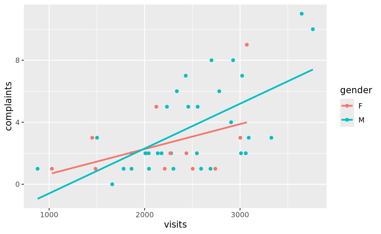
Modeling Practice
Go ahead and build an interaction model first to see if we have evidence that there might be an interaction between these two predictors
int_mod = _________________
_______________
int_mod = lm(data = esdcomp,________ ~ ______________)
summary(________)int_mod = lm(data = esdcomp, complaints ~ visits * gender)
summary(int_mod)Alternative Model Practice
If done correctly, we get a p-value of 0.324 from the interaction model. This suggests we don’t have much evidence here that the relationship between visits and complaints depends on gender.
It’s still possible there is an additive relationship–that one gender receives more complaints on average, even after controlling for number of visits!
Try an additive model
int_mod = _________________
_______________
add_mod = lm(data = esdcomp,________ ~ ______________)
summary(________)add_mod = lm(data = esdcomp, complaints ~ visits + gender)
summary(add_mod)Additive Model Interpretations
If done correctly, the p-value for the additive term (with no interaction term) is rather high. This means, among doctors with the same number of visits, we don’t see an additive difference in complaints between male and female doctors from this sample of data.
That doesn’t necessarily mean no difference based on gender here–we do have a relatively small sample size, so there might be a small effect here that we can’t detect with this sample size.
Simple Model Plots
For sake of completion, let’s also look at the simple plots
mod_visits = lm(data = esdcomp, complaints ~ visits)
summary(mod_visits)
##
## Call:
## lm(formula = complaints ~ visits, data = esdcomp)
##
## Residuals:
## Min 1Q Median 3Q Max
## -3.2660 -1.7944 -0.5724 1.9697 4.3786
##
## Coefficients:
## Estimate Std. Error t value Pr(>|t|)
## (Intercept) -2.8678871 1.3566826 -2.114 0.0405 *
## visits 0.0026026 0.0005504 4.729 2.56e-05 ***
## ---
## Signif. codes: 0 '***' 0.001 '**' 0.01 '*' 0.05 '.' 0.1 ' ' 1
##
## Residual standard error: 2.264 on 42 degrees of freedom
## Multiple R-squared: 0.3474, Adjusted R-squared: 0.3319
## F-statistic: 22.36 on 1 and 42 DF, p-value: 2.557e-05ggplot(data = esdcomp, aes(x = visits, y = complaints)) +
geom_point() +
geom_smooth(method = "lm", se = FALSE)## `geom_smooth()` using formula = 'y ~ x'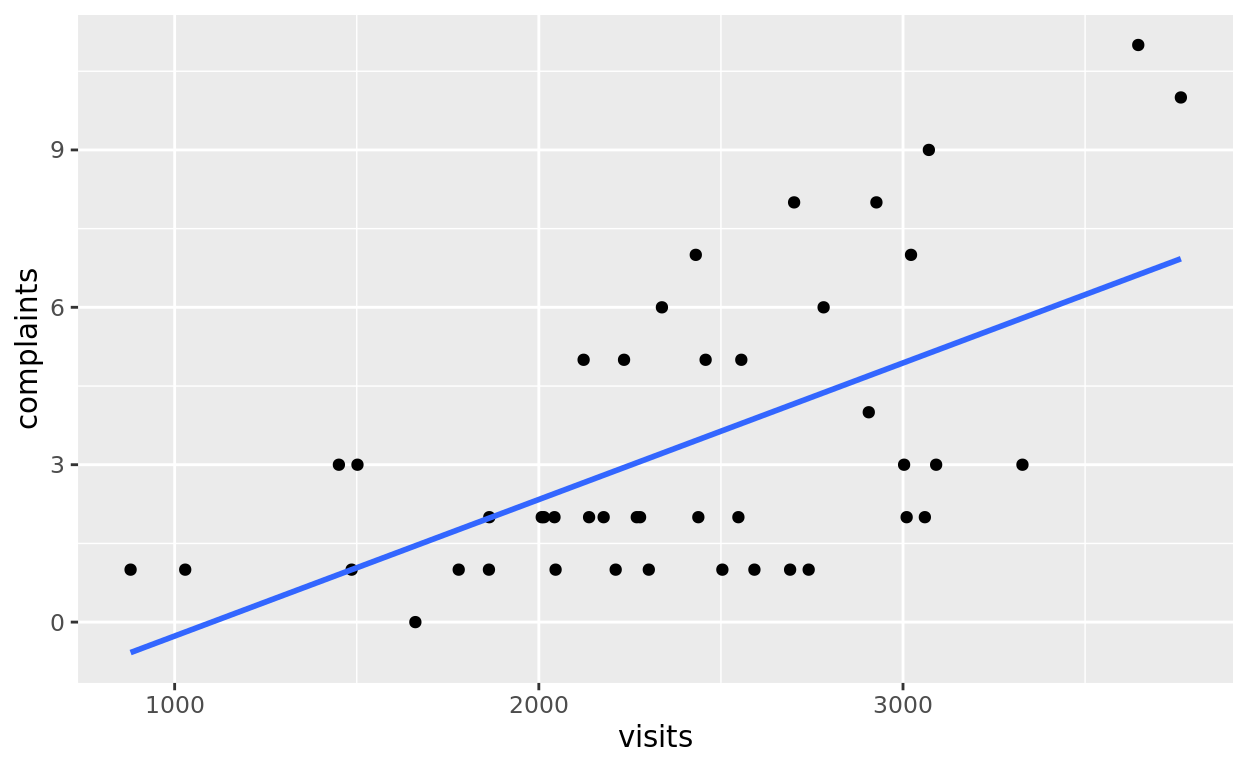
mod_gender = lm(data = esdcomp, complaints ~ gender)
summary(mod_gender)
##
## Call:
## lm(formula = complaints ~ gender, data = esdcomp)
##
## Residuals:
## Min 1Q Median 3Q Max
## -3.625 -1.625 -1.104 1.375 7.375
##
## Coefficients:
## Estimate Std. Error t value Pr(>|t|)
## (Intercept) 2.5833 0.7973 3.240 0.00234 **
## genderM 1.0417 0.9350 1.114 0.27156
## ---
## Signif. codes: 0 '***' 0.001 '**' 0.01 '*' 0.05 '.' 0.1 ' ' 1
##
## Residual standard error: 2.762 on 42 degrees of freedom
## Multiple R-squared: 0.02871, Adjusted R-squared: 0.00558
## F-statistic: 1.241 on 1 and 42 DF, p-value: 0.2716ggplot(data = esdcomp, aes(x = gender, y = complaints, color = gender)) +
geom_jitter(width = 0.05) +
geom_smooth(method = "lm", se = FALSE)## `geom_smooth()` using formula = 'y ~ x'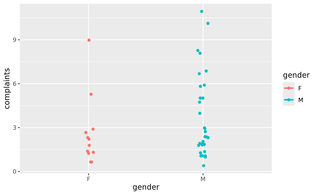
Simple model interpretations
We do see evidence that more visits seems to correlate with more complaints. That should make sense!
We don’t see any simple relationship between gender and complaints.
With just these two predictors, it seems like a simple relationship between visits and complaints is the most sensible! It would be interesting though to recheck these with:
- A larger sample of doctors. Especially if we had more than 14 female doctors
- Other potential predictors.
Return Home
That’s all folks!
If you’d like to go back to the tutorial home page, click here: https://stat212-learnr.stat.illinois.edu/