Introduction
Goals
This tutorial will explore:
- A Review of visualizing proportions using a 100% stacked barplot
- Comparing proportions using a z-test/Chi-square test
- Comparing means using a t-test
- OPTIONAL: Comparing 3 or more means using ANOVA.
One-sample Inference
In this tutorial, we will proceed straight to multi-group comparison inference (comparing two means, comparing two proportions, and comparing 3+ means). These methods are more widely used in application.
For information on completing a one-sample test or interval in R, feel free to check the resources linked below, but you won’t need them for this class!
Preparing Binary Outcome Data
0’s and 1’s vs. Descriptive labels
Sometimes when working with binary outcome data, one of the variables will coded as 0’s and 1’s instead of descriptive labels like “Yes” and “No.”
Consider this fictional dataset of students in a class. One of the variables athlete indicates whether or not the student is an athlete (1 = athlete, 0 = not an athlete).
Class = data.frame(
  name = c("Dan", "Mimi", "Courtney", "Rami", "Noah", "Kit", "Kishan", "Mariana", "Bash", "Emma"),
  height = c(70, 65, 64, 68, 72, 67, 66, 69, 70, 61),
  acad_level = c("Freshman", "Junior", "Junior", "Sophomore", "Junior", "Freshman", "Senior", "Sophomore", "Junior", "Freshman"),
  siblings = c(2, 0, 2, 3, 1, 4, 1, 6, 4, 0),
  athlete = c(0,0,0,1,1,0,1,0,1,0)
)

Class
Making the Athlete variable outcomes descriptive
If we wanted to make some visualization or contingency tables with this variable, it would be easier to read if we converted the 0’s and 1’s into “Yes” and “No” labels or “Athlete” and “Not Athlete” labels.
We can do that by setting up an ifelse statement
Ifelse statement
An ifelse statement (that is ifelse as in “if else”, not ifelse as in i felse. This is not an apple product!) takes three arguments:
ifelse(condition, value if true, value if false)
So for our example, we might try something like this:
ifelse(athlete == 1, "Athlete", "Not Athlete")
Setting it up
To actually apply this change to our dataframe, let’s create a pipe and use the mutate function. The mutate function allows us to create a new variable or modify an existing variable.
Notice a few things here:
- We should save the result back into the original dataframe name if we want to keep the changes.
- I chose save these descriptive results to a new variable name
athlete_descso that we have a copy of both! Alternatively, we could overwrite the original variableathlete. - It’s up to you what to label these! If you want “Yes” and “No” instead of “Athlete” and “Not Athlete”, just change the text.
Class = Class |>
  mutate(athlete_desc = ifelse(athlete == 1, "Athlete", "Not Athlete"))

Class
Multiple mutates
If you wanted to adjust more than one variable, just add a comma and a new line inside mutate
Here is one that also converts sibling count to “Has siblings” and “No siblings”
Class = Class |>
  mutate(athlete_desc = ifelse(athlete == 1, "Athlete", "Not Athlete"),
         sibling_desc = ifelse(siblings > 0, "Has siblings", "No siblings"))

Class
Visualizing Proportions
Pima Health Data
The Pima.tr dataset contains data on 200 women of Pima Indian heritage living near Phoenix, Arizona. As part of a Health study on this population, medical researchers gathered data for several health-related variables.
The Data
This data is one of many inside the MASS package. Take a look at the data here!
library(MASS)
Pima.tr
Posing a question
One of the variables collected was whether the participant was considered “diabetic” according to World Health Organization criteria (represented as the variable type). Researchers are curious if the proportion of PIMA women who are diabetic is different depending on whether that woman had been pregnant in the past before.
Guiding Question: Are women with a past pregnancy more likely to be diabetic than women who have not been pregnant?
Creating our predictor variable
The pregnancy variable indicates women who have been pregnant at least once (“Yes”) and women who have not been pregnant before (“No”).
Let’s first look at an unstacked barplot to compare these groups in terms of diabetic status.
ggplot(data = Pima.tr, aes(x = pregnancy, fill = type)) +
  geom_bar(color = "black", width = 0.5) +
  labs(x = "At least 1 pregnancy", fill = "Diabetic")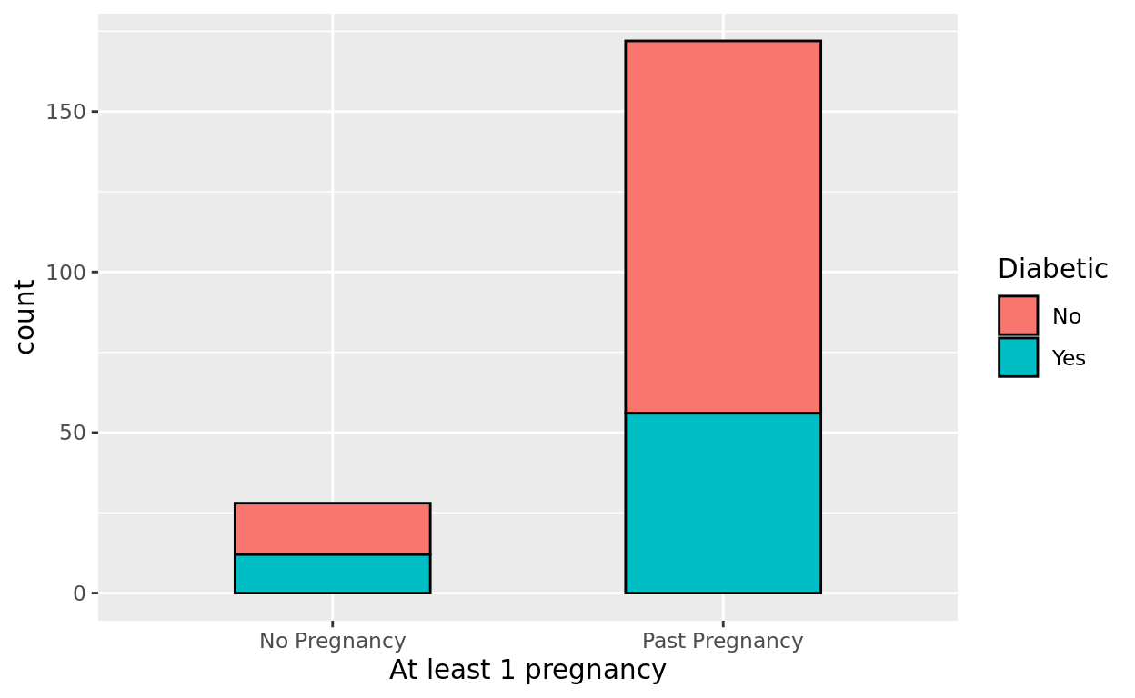
Visualizing Proportionally
Let’s now make a visual that makes the proportional comparison easier to see. Create the barplot again, but this time, as a stacked barplot with position = "fill"
ggplot(data = Pima.tr, aes(x = pregnancy, fill = type)) +
  geom_bar(position = "fill", color = "black", width = 0.5) +
  labs(x = "At least 1 pregnancy", y = "Proportion", fill = "Diabetic")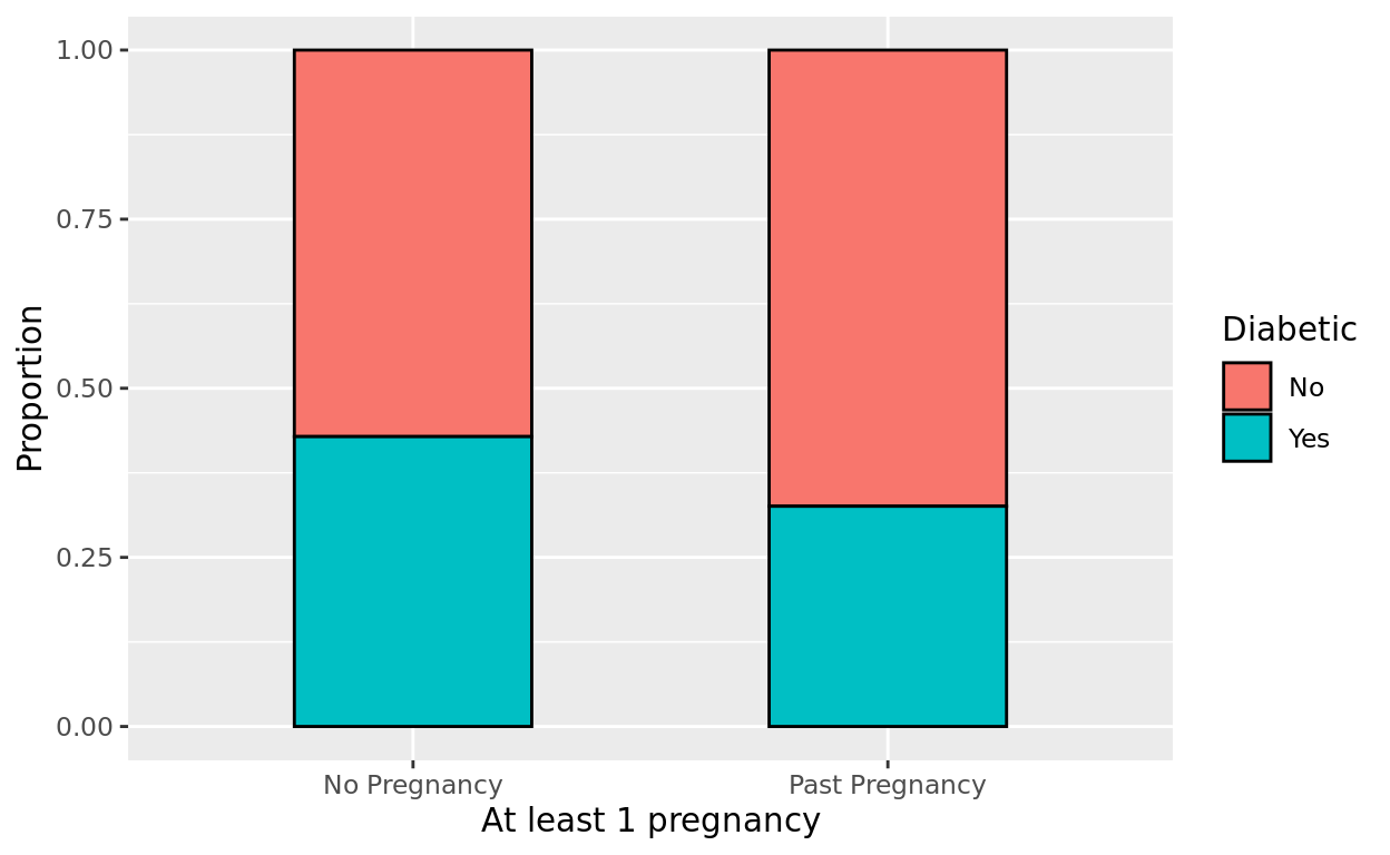
Theme Note
We will talk about this in a coming tutorial, but you can add general plot themes in ggplot to change the background paneling and layout.
I mention this here because I thinktheme_hc() looks especially nice with stacked barplots. Just note that you may need to install and then library the ggthemes package to use this particular theme option.
library(ggthemes)

ggplot(data = Pima.tr, aes(x = pregnancy, fill = type)) +
  geom_bar(position = "fill", color = "black", width = 0.4) +
  labs(x = "At least 1 pregnancy", y = "Proportion", fill = "Diabetic") +
  theme_hc()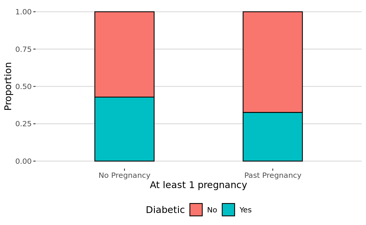
Testing Proportions
How to test for a difference
To see if the difference can be explained by random chance or not, we’ll need a two-sample test for proportions. We can use the prop.test function for that.
Using prop.test
The prop.test function in R is a straightforward choice for this comparison. It takes two arguments:
x: the number of cases with the criteria of interestnthe total number of cases in each group.
Comparing Professor Arden and and Professor Bernard
Before exploring the Pima data question, let’s start with a simpler example.
Let’s say that I want to know if the proportion of “A’s” between Professor Arden’s class and Professor Bernard’s class might be different or not.
- 100 people took the course with professor Arden this semester, and 50 of them got an “A.”
- 90 people took the course with professor Bernard the same semester, and 35 of them got an “A.”
Testing that Difference
READ THIS
To apply this information to our prop.test function, we first identify the number of A’s in each group we are comparing–those go in the x vector first.
Then we identify the size of each group–those go in the n vector and should go in the same order as you did the first one.
prop.test(x = c(50, 35),
          n = c(100,90))
##
## 2-sample test for equality of proportions with continuity correction
##
## data: c(50, 35) out of c(100, 90)
## X-squared = 1.9373, df = 1, p-value = 0.164
## alternative hypothesis: two.sided
## 95 percent confidence interval:
## -0.03996995 0.26219217
## sample estimates:
## prop 1 prop 2
## 0.5000000 0.3888889Making sense of that code
Our first vector is telling us that Professor Arden had 50 A’s, while Professor Bernard had 35 A’s.
The second vector is telling us that there are a total of 100 students in Professor Arden’s class, and 90 students in Professor Bernard’s class.
Notice that order matters there. If Professor Arden has 50 A’s out of a group size of 100, make sure 50 and 100 both come first or both come second in their respective vectors!
Frequency Table Needed
Notice that in the Pima.tr dataset, each row is either a Yes or No, but I don’t have the frequency totals provided for me to plug into prop.test. I need to create a frequency table first.
We can do that with the table function!
Frequency Table Example
First, we write table, and inside the parentehses, we identify the two vectors that we want to cross-tabulate. Since each variable has two categories, we’ll end up with a 2x2 contingency table.
Note that this is a base R function, so we do need to specify the dataframe that each variable comes from here as well!
table(Pima.tr$pregnancy, Pima.tr$type)##
## No Yes
## No Pregnancy 16 12
## Past Pregnancy 116 56Optional: Adding totals
It may be helpful to see row and column totals. If wanting to do that, just add the function, addmargins around your table function. Or if you assign your table a name like in that last example, just run addmargins(table_name)
addmargins(table(Pima.tr$pregnancy, Pima.tr$type))##
## No Yes Sum
## No Pregnancy 16 12 28
## Past Pregnancy 116 56 172
## Sum 132 68 200Testing for a Difference in Proportions - Table
Now, how do we take this information to plug into prop.test?
- First, remember what our response variable is. In this situation, it’s our
type(is patient diabetic or not) and the column labeled yes represents those who are diabetic. - Second, recognize that the two values in the
type“Yes” column represent the two values we’re placing in ourxvector–number of cases where criteria of interest (diabetic status) is true. - Third, figure out the group totals for each of the
pregnantcategories. What total number of cases are “Yes” for pregnant, and what total number of cases are “No” for pregnant?
Plugging them in
Please be careful to read this and think about the process of extracting numbers from the frequency table to here. Many students make a mistake here.
- There were 12 diabetics in the no pregnancy group (12+16 = 28 total in that no pregnancy group)
- There were 56 diabetics in the past pregnancy group (56 + 116 = 172 total in that past pregnancy group)
prop.test(x = c(12, 56),
          n = c(28, 172))
##
## 2-sample test for equality of proportions with continuity correction
##
## data: c(12, 56) out of c(28, 172)
## X-squared = 0.72552, df = 1, p-value = 0.3943
## alternative hypothesis: two.sided
## 95 percent confidence interval:
## -0.1139955 0.3199756
## sample estimates:
## prop 1 prop 2
## 0.4285714 0.3255814Interpreting Results
Notice at the bottom, it provides the sample proportions for each group.
- The proportion of never pregnant women with diabetes is 0.429
- The proportion of previously pregnant women with diabetes was 0.326.
At the top, we find a p-value.
- Based on a p-value of 0.3943, we have little to no evidence of a difference in diabetic rates between these two groups. This difference could be explained as random chance here.
We also get a 95% confidence interval for the true difference in proportions. That may or may not be interesting depending on the context. In some cases, we might instead wish to calculate the relative risk (or odds ratio) value and confidence interval.
Directional Alternative?
If this happened to be a situation where we only found a result in one direction to be noteworthy, we could add a directional indication on the test.
If we wished to indicate that, we would need to add a 3rd argument:
alternative: can be set to “greater” “less” or “equal” where equal would be the default choice when we don’t define it.
Professor Example
Let’s consider this alternative with the Professor Arden vs. Bernard question
- Professor Arden and Bernard are using the same Final Exam, but Professor Arden had a tutoring center option for their students, while Professor Bernard did not.
- As a result, we would only find it noteworthy if Professor Arden’s students were more likely to get A’s.
Adding it in the code
To decide whether to write “less” or “greater”, we need to think about which group is listed first. Since we have professor Arden’s numbers listed first, then our alternative will be that Professor Arden’s proportion is “greater” than Professor Berard’s proportion.
Professor Arden prop > Professor Bernard prop
prop.test(x = c(50, 35),
          n = c(100, 90),
          alternative = "greater")
##
## 2-sample test for equality of proportions with continuity correction
##
## data: c(50, 35) out of c(100, 90)
## X-squared = 1.9373, df = 1, p-value = 0.08198
## alternative hypothesis: greater
## 95 percent confidence interval:
## -0.01737716 1.00000000
## sample estimates:
## prop 1 prop 2
## 0.5000000 0.3888889Interpreting
We see a p-value of 0.08, suggesting mild evidence (but not particularly strong evidence) that Professor Arden’s class results in a higher proportion of A’s compared to Professor Bernard.
NOTE: When choosing a directional option, ignore the confidence interval output–it represents something different!
Visualizing/Testing Means (Optional)
Proportions vs. Means
Remember that means are measures we might take from numeric variables. Proportions are measures we use with categorical variables. Let’s next consider testing involving a comparison of two means!
Should we do a t-test?
Remember that when our sample size is not particularly large, we need a “t-correction” to account for our estimate of the standard deviation using only our sample data. When our sample size is fairly large though, the difference between a t-test and z-test is negligible.
When using software, it’s fine to just always do a t-test for that reason, since the t-test results will correctly converge toward the results from a z-test!
Two-sample t-test
Consider the birthwt dataset from the MASS package.
birthwtOne question we might investigate is whether mothers who reported smoking during the pregnancy (smoke_answer) were more likely to give birth to babies with a lower birth weight (bwt) on average.
ggplot(data = birthwt, aes(x = smoke_answer, y = bwt, fill = smoke_answer)) +
  geom_boxplot() +
  stat_boxplot(geom = "errorbar") +
  labs(y = "Birth weight (g)", x = "Smoking Status")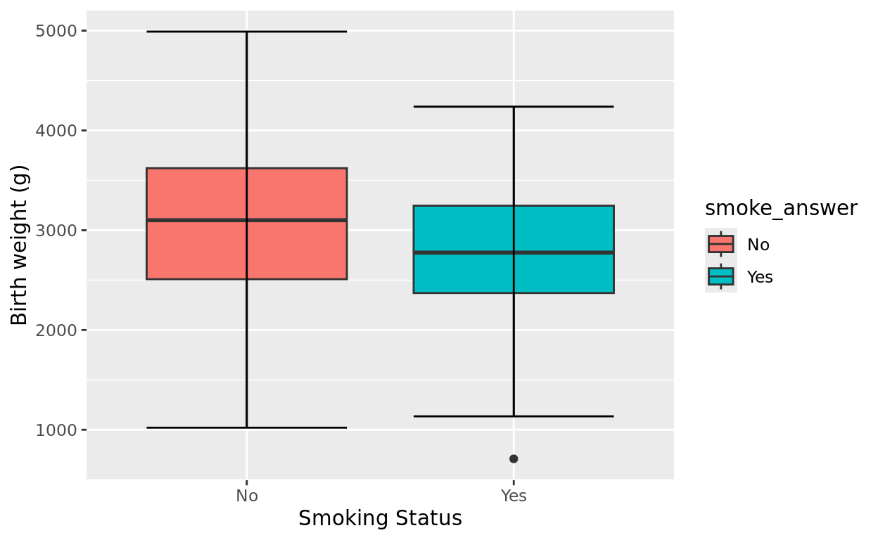
Is a Pooled Method Appropriate?
Visually, it appears that the variance of each group is similar. But when using software, an unpooled method is the “safer” choice. We will always choose an unpooled method when using software in our class!
t.test
We will use the t.test function for the comparison. This test takes the following arguments
data: the data frame where our varaibles are located.- Simple entry of your response variable ~ predictor variable, with the
~connecting the two! var.equal: whether to assume equal variances. We will typically chooseFALSEas the safer testing choice when there is no reason to assume variances of each population is equal.alternative: again, an option to identify if we are doing a directional test.
Trying with the births example
For now, let’s start with a non-directional test.
- The data frame we are working from is
birthwt - The response variable we are comparing means from is
bwt, and we are usingsmoke_answeras the grouping variable to compare means from.
Note: Putting the response variable first and grouping variable second is important!
t.test(data = birthwt,
       bwt ~ smoke_answer,
       var.equal = FALSE)
##
## Welch Two Sample t-test
##
## data: bwt by smoke_answer
## t = 2.7299, df = 170.1, p-value = 0.007003
## alternative hypothesis: true difference in means between group No and group Yes is not equal to 0
## 95 percent confidence interval:
## 78.57486 488.97860
## sample estimates:
## mean in group No mean in group Yes
## 3055.696 2771.919A non-directional output
Notice our sample means
- Non-smoking mothers give birth to babies with an average weight of 3,055 grams
- Smoking mothers give birth to babies with an average weight of 2,771 grams
Notice our p-value
- Our p-value is 0.007, suggesting that we have very strong evidence for a difference in mean birth weight between these two populations. It’s unlikely we would see this much difference in our sample means by random chance.
Also of interest, we get a confidence interval for the true mean difference as well!
- We are 95% confident that the true difference in mean birth weight between non-smoking birth mothers and smoking mothers to be between 78 grams and 488 grams.
Doing Directional Tests
Directional tests may be completed if we would only find a difference in one direction possible or noteworthy.
Perhaps we had a theory that smoking affected the pregnancy and caused decreased birth weight. If that’s the case, then alphabetically, our groups are No and Yes in that order (check the data frame again if you’d like to verify the category names here!).
Alternative: No (smoking) ___ Yes (smoking)
Putting in into code
If our theory says that smoking should increase the likelihood of premature/low weight birth, then our alternative is that weight for non-smoking > weight for smoking. So we would plug in greater!
t.test(data = birthwt,
       bwt ~ smoke_answer,
       var.equal = FALSE,
       alternative = "greater")
##
## Welch Two Sample t-test
##
## data: bwt by smoke_answer
## t = 2.7299, df = 170.1, p-value = 0.003501
## alternative hypothesis: true difference in means between group No and group Yes is greater than 0
## 95 percent confidence interval:
## 111.8548 Inf
## sample estimates:
## mean in group No mean in group Yes
## 3055.696 2771.919Making sense of a Directional result
Notice that the p-value is now half the size it was before. That reflects that if left up to random chance, the probability of finding a difference this high or higher in only one direction is half as likely as finding that much difference in either direction.
ANOVA (Optional)
What is ANOVA?
ANOVA stands for Analysis of Variance and is a statistical technique for modeling how one or more categorical predictors explain variability in a numeric response. In this tutorial, we will use its most simple application: comparing differences in means between 3 or more populations. This particular use is called “One-Way ANOVA.”
ANOVA Comparison
Let’s examine the penguins data from palmerpenguins. There are 3 species in this data.
Now, let’s see if the three species might plausibly have the same average bill length or not.
ggplot(data = penguins, aes(x = species,
                            y = bill_length_mm,
                            fill = species,
                            color = species)) +
  geom_jitter(width = 0.05)
## Warning: Removed 2 rows containing missing values or values outside the scale range
## (`geom_point()`).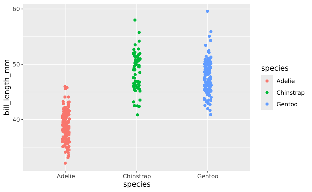
Running an ANOVA
We can do that by using the aov function, saving this result as a model, and then taking a summary of that model.
Notice again–the numeric variable comes first, followed by the grouping variable.
penguin_model = aov(data = penguins,
                    flipper_length_mm ~ species)
summary(penguin_model)
## Df Sum Sq Mean Sq F value Pr(>F)
## species 2 52473 26237 594.8 <2e-16 ***
## Residuals 339 14953 44
## ---
## Signif. codes: 0 '***' 0.001 '**' 0.01 '*' 0.05 '.' 0.1 ' ' 1
## 2 observations deleted due to missingnessInterpreting the results
We find a p-value of 2x10^-16, which is extremely low. This is actually the lowest value R will output unless we manually request for more precision.
Basically, we have VERY strong evidence that the difference in means we observed in our sample results would not show up by random chance if these three species indeed had equals means.
Tukey Test for pairwise comparisons
If we want to check further for pairwise comparisons, we can run a tukey test using the TukeyHSD function. The only input for this function is the already created ANOVA model.
penguin_model = aov(data = penguins,
                    flipper_length_mm ~ species)

TukeyHSD(penguin_model)
## Tukey multiple comparisons of means
## 95% family-wise confidence level
##
## Fit: aov(formula = flipper_length_mm ~ species, data = penguins)
##
## $species
## diff lwr upr p adj
## Chinstrap-Adelie 5.869887 3.586583 8.153191 0
## Gentoo-Adelie 27.233349 25.334376 29.132323 0
## Gentoo-Chinstrap 21.363462 19.000841 23.726084 0From this results we see strong evidences that all species have different means from one another. The p-values are so low that they round to 0 in the output (granted they aren’t actually 0, but are all very small numbers).
Return Home
This tutorial was created by Kelly Findley, with assistance from Brandon Pazmino (UIUC ’21). We hope this experience was helpful for you!
If you’d like to go back to the tutorial home page, click here: https://stat212-learnr.stat.illinois.edu/