Introduction
Goals
In this tutorial, we will cover several additional functions you can use to customize and enhance your visualizations with ggplot. This includes:
- Choosing custom colors
- Choosing color palettes (a defined group of colors that go well together!)
- Adding a pre-built plot-theme to change the background paneling or axis style
- Using
themeto customize specific features, like the placement and font of the title, axis labels, and legends - Using scale functions to adjust axis tick marks.
A great resource
If you’re interested in looking at more cool things you can do with R beyond what you’re learning here, check out the R Graph Gallery! Easy to web search, but also linked here: https://r-graph-gallery.com/index.html
Colors in R
Color as a Representation
Color can do a lot for data visuals. Not only can it brighten up a dreary plot, it can also stand in as one more layer of representation in your plot. In this section, we’ll explore several ways to add and customize color options in R.
What Colors are Available??
For a complete listing of colors, I recommend the “Colors in R” document. Which can be found with an easy web search. Also linked here: http://www.stat.columbia.edu/~tzheng/files/Rcolor.pdf
One thing you might want to notice is that colors have descriptive names, and they also have unique IDs. Either can be used to identify and use a color in a plot.
Default Colors
The following code creates boxplots to compare the petal lengths of three species of iris plants.
Color is used here to simply fill each boxplot with a unique shade. R defaults to a generic color palette, but we could change these!
ggplot(data = iris, aes(x = Species, y = Petal.Length, fill = Species)) +
  geom_boxplot() +
  stat_boxplot(geom = "errorbar")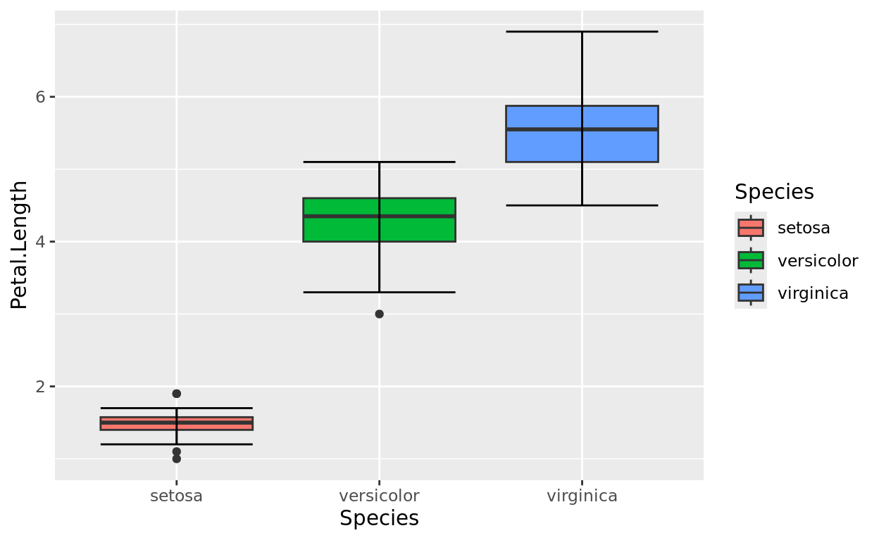
Manual change to fill/color
If you wish to manually select specific colors to include in your plot, you will likely want one of these two functions:
scale_fill_manual: apply manually chosen colors to apply to a fill representationscale_color_manual: apply manually chosen colors to apply to a color (border, point) representation
An Example with fill
Since our mapping is to fill, let’s use scale_fill_manual Notice that we only need to write one argument:
values: a vector of color names to apply as needed.
Since we have 3 boxes to fill, we need 3 colors.
I just picked some colors from the link provided earlier, but we could fill in any color names we wish.
ggplot(data = iris, aes(x = Species, y = Petal.Length, fill = Species)) +
  geom_boxplot() +
  stat_boxplot(geom = "errorbar") +
  scale_fill_manual(values = c("khaki2","plum3","springgreen4"))
Manual change to border color
We could do the same thing with border colors (or point colors) using scale_color_manual.
ggplot(data = iris, aes(x = Species, y = Petal.Length, color = Species)) +
  geom_boxplot() +
  stat_boxplot(geom = "errorbar") +
  scale_color_manual(values = c("khaki2","plum3","springgreen4"))
Note that for boxplots, this will work as a border color. Maybe you like the border coloring better than the fill coloring!
Color Palettes
Choosing a Color Palette
If you don’t feel like choosing colors manually, you might like to use a pre-made palette.
I recommend the palettes loaded in the RColorBrewer package (which will be included already with tidyverse). You can find several examples here:
New function names
If using a palette, here are four functions you might need:
scale_fill_brewer: applying a palette to a fill mapping that takes categorical entriesscale_color_brewer: applying a palette to a color mapping (borders, points) that takes categorical entriesscale_fill_distiller: applying a palette to a fill mapping that takes a numeric scalescale_color_distiller: applying a palette to a color mapping (borders, points) that takes a numeric scale
Example with scale_fill_brewer
In this example, Species is a categorical variable, so I need to use brewer. Furthermore, I’m mapping it as a fill color.
We need scale_fill_brewer!
I’m going to choose the YlGn palette, but feel to try another palette from that link.
ggplot(data = iris, aes(x = Species, y = Petal.Length, fill = Species)) +
  geom_boxplot() +
  stat_boxplot(geom = "errorbar") +
  scale_fill_brewer(palette = "YlGn")
Palettes for Borders/Points
Still using Species, but now let’s change the mapping to be a color. For a boxplot, that will change the box border colors.
So let’s update the function to scale_color_brewer now.
ggplot(data = iris, aes(x = Species, y = Petal.Length, color = Species)) +
  geom_boxplot() +
  stat_boxplot(geom = "errorbar") +
  scale_color_brewer(palette = "Set2")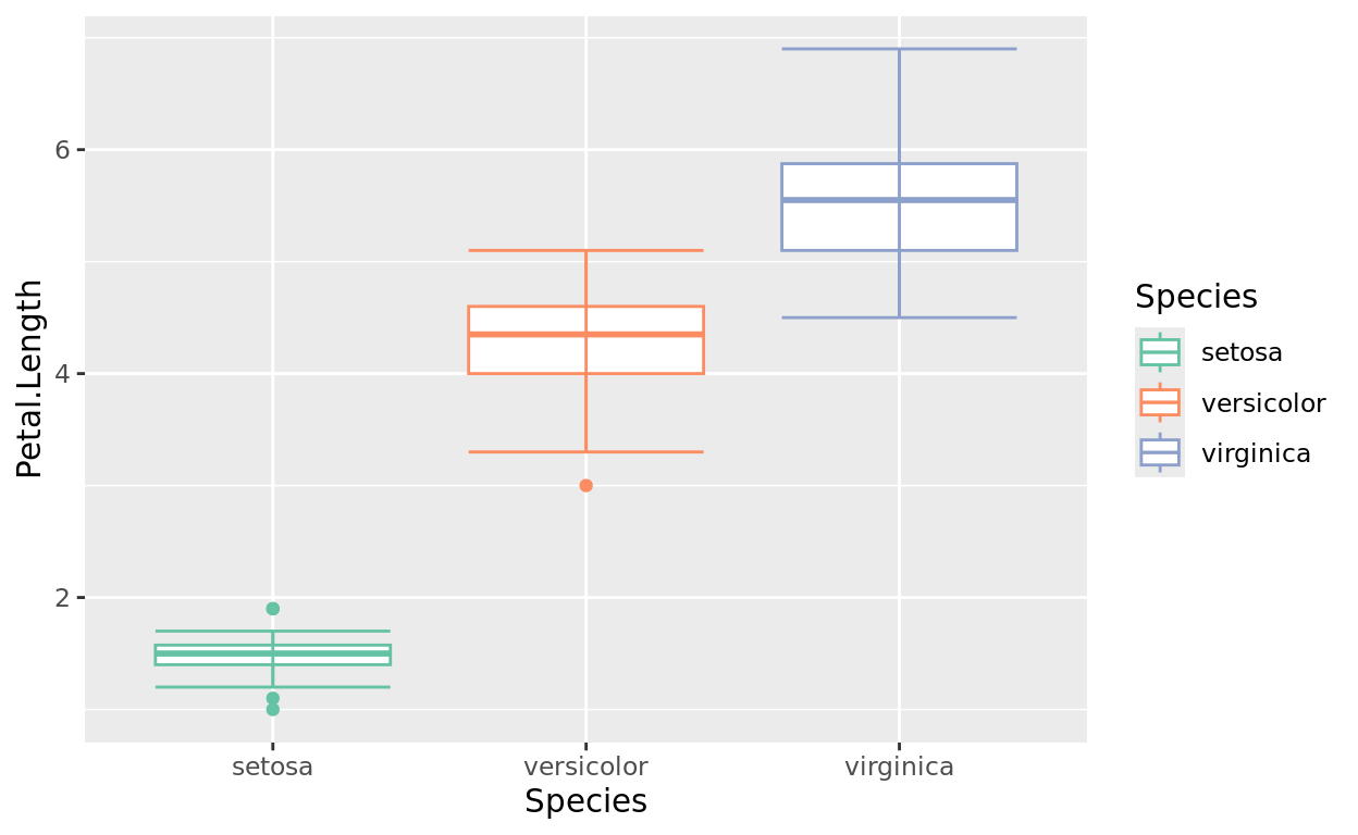
A Point Example for “color”
Let’s try points with a jitter plot.
Notice that with points, a color mapping will show up with color rather than fill.
We’re still working with a categorical variable in Species.
ggplot(data = iris, aes(x = Species, y = Petal.Length, color = Species)) +
  geom_jitter(width = 0.05) +
  scale_color_brewer(palette = "Set2")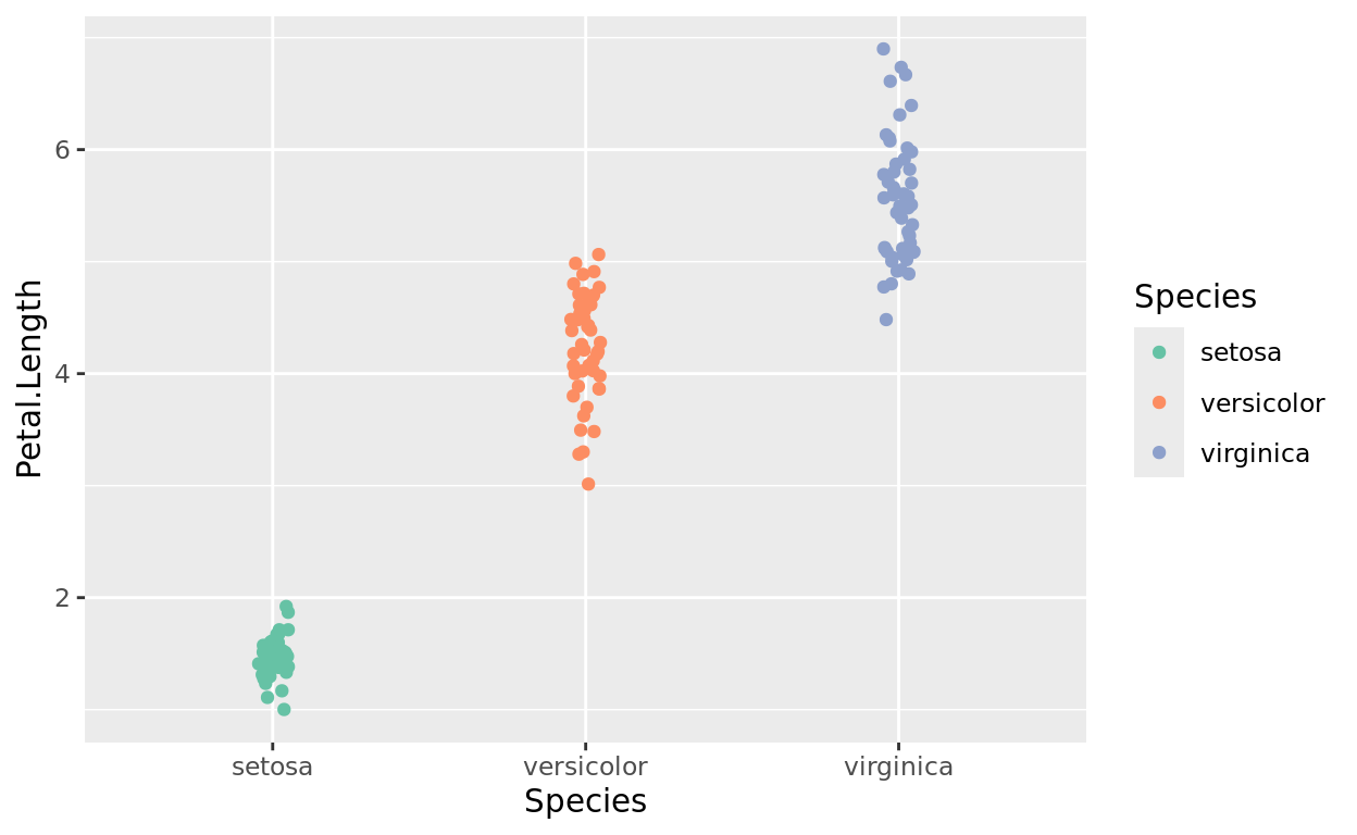
Scale Distiller
Use scale_color_distiller or scale_fill_distiller to set a color scheme for numeric variables as a spectrum effect.
The following plot applies color to a 3rd numeric variable not already represented: Petal.Width. So now, each point will be colored on a scale to represent that plant’s petal width reading.
ggplot(data = iris, aes(x = Species, y = Petal.Length, color = Petal.Width)) +
  geom_jitter(width = 0.05) +
  scale_color_distiller(palette = "Reds")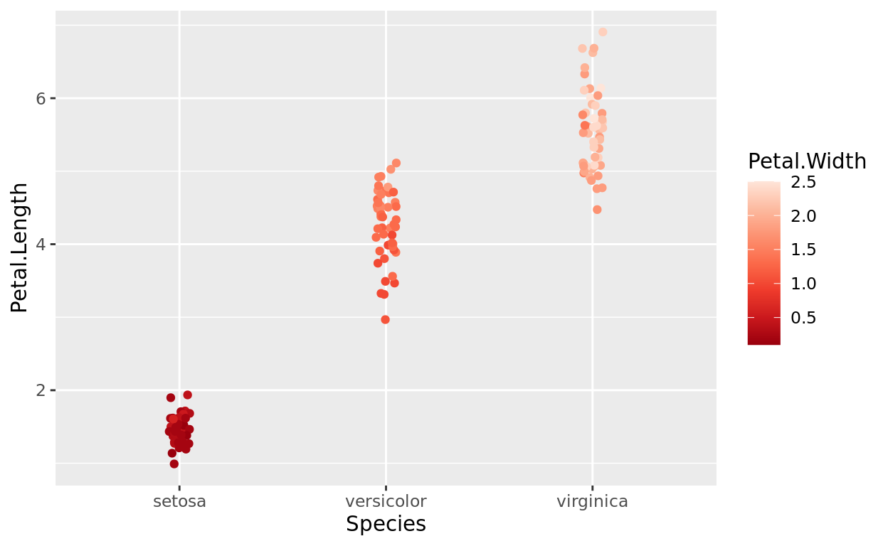
To no surprise, we notice that irises with larger petal lengths also tend to have larger petal widths.
Pre-made Plot Themes
What is a Plot Theme?
Changing the style of your plot can also just make it look more professional. Plot themes most obviously affect the background, in addition to other small formatting differences.
Built-in Plot Themes: theme_classic
There are a collection of built in plot themes for ggplot2 that you can enact with an additional line of code.
For example, the plot theme below, theme_classic(), creates a blank canvas rather than the grey default grid. It’s a nice “gridless” option.
ggplot(data = iris, aes(x = Species, y = Petal.Length, color = Species)) +
  geom_jitter(width = 0.05) +
  scale_color_brewer(palette = "Set2") +
  theme_classic() +
  labs(title = "Petal Length of each Iris Species")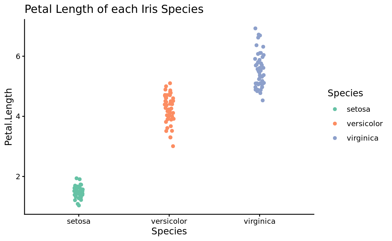
theme_minimal
I also like theme_minimal if you want a basic grid, but no axis lines.
ggplot(data = iris, aes(x = Species, y = Petal.Length, color = Species)) +
  geom_jitter(width = 0.05) +
  scale_color_brewer(palette = "Set2") +
  theme_minimal() +
  labs(title = "Petal Length of each Iris Species")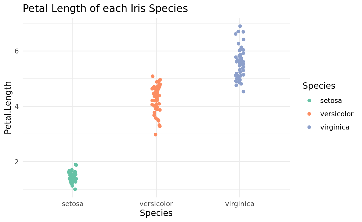
theme_bw
Generally, my favorite is theme_bw as it has a nice clean look with a white background and grey grid lines.
ggplot(data = iris, aes(x = Species, y = Petal.Length, color = Species)) +
  geom_jitter(width = 0.05) +
  scale_color_brewer(palette = "Set2") +
  theme_bw() +
  labs(title = "Petal Length of each Iris Species")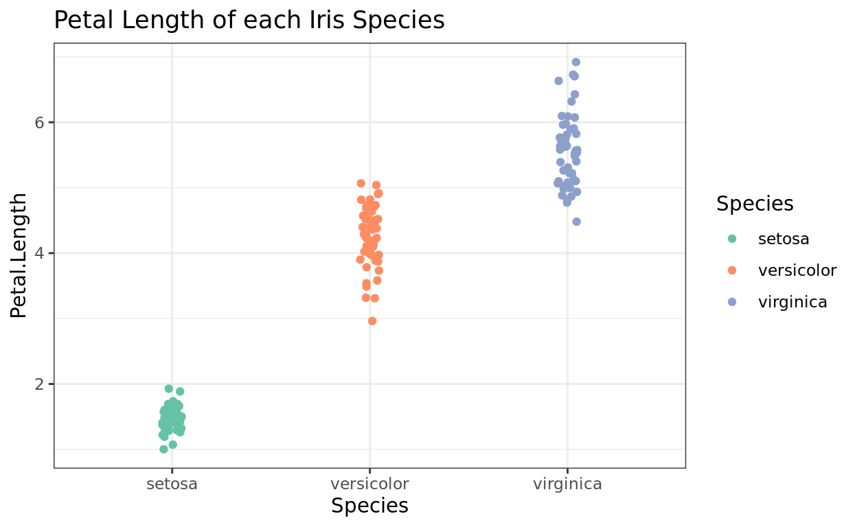
Where to find more?
For more themes you can apply, check out: https://www.datanovia.com/en/blog/ggplot-themes-gallery/
You might find others that you really like for different purposes, like theme_dark()
ggplot(data = iris, aes(x = Species, y = Petal.Length, color = Species)) +
  geom_jitter(width = 0.05) +
  scale_color_brewer(palette = "Set2") +
  theme_dark() +
  labs(title = "Petal Length of each Iris Species")
Customizing Labels
Using the theme function
The theme function allows for a lot of specific customizations. For this class, we’ll focus on changes to:
- plot titles
- axis titles
- axis labels
- legend titles
Changing labels
If you want to customize the title, use the plot.title argument.
By default, the title will be left-aligned, with a particular font and look. Let’s customize three things
sizewill adjust the font sizehjustwill adjust the alignment. 0 is left-aligned and 1 is right-aligned, while 0.5 is centeredfaceallows us to choose whether we want toboldoritalicthe font style.
ggplot(data = iris, aes(x = Species, y = Petal.Length, color = Species)) +
  geom_jitter(width = 0.05) +
  labs(title = "Iris Species by Petal Length",
       x = "Species",
       y = "Petal Length") +
  theme(plot.title = element_text(size = 14, hjust = 0.5, face = "bold"))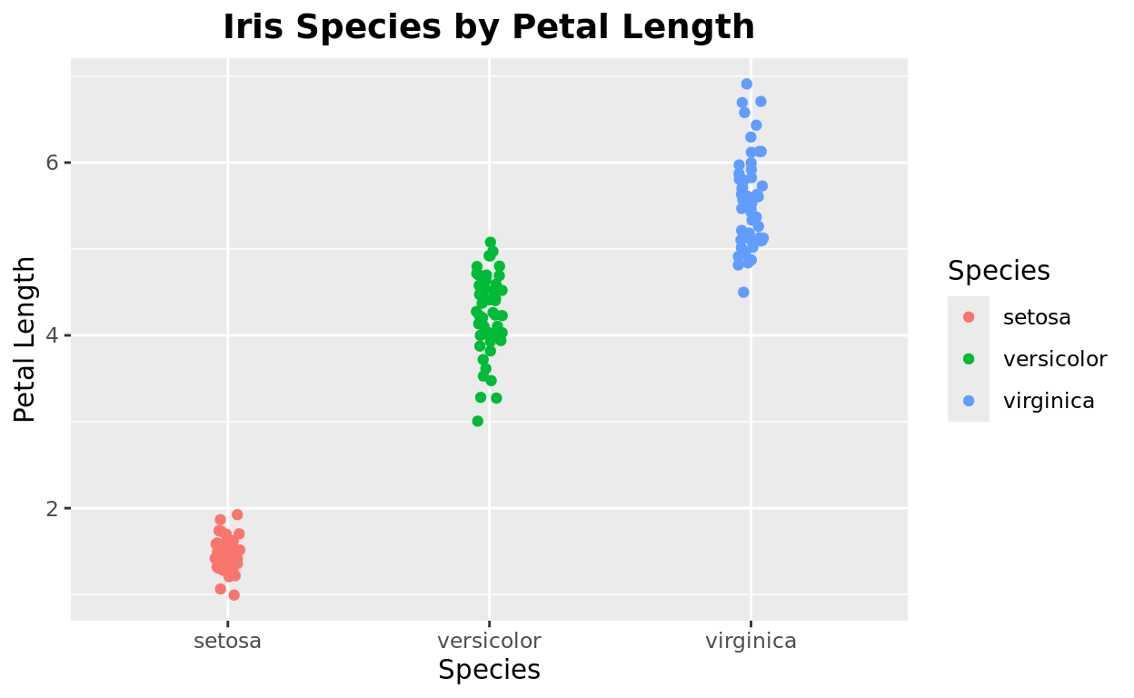
Axis titles
Likewise, we can make similar changes with the axis titles too!
ggplot(data = iris, aes(x = Species, y = Petal.Length, color = Species)) +
  geom_jitter(width = 0.05) +
  labs(title = "Iris Species by Petal Length",
       x = "Species",
       y = "Petal Length") +
  theme(plot.title = element_text(size = 14, hjust = 0.5, face = "bold"),
        axis.title = element_text(size = 12, face = "bold"))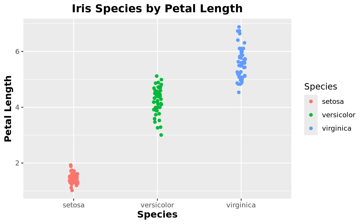
Axis Labels
…and changes to the axis scales. Personally, I like to color these black since the default grey color makes them hard to read. And also make the font a bit bigger.
ggplot(data = iris, aes(x = Species, y = Petal.Length, color = Species)) +
  geom_jitter(width = 0.05) +
  labs(title = "Iris Species by Petal Length",
       x = "Species",
       y = "Petal Length") +
  theme(plot.title = element_text(size = 14, hjust = 0.5, face = "bold"),
        axis.title = element_text(size = 12, face = "bold"),
        axis.text = element_text(size = 11, color = "black"))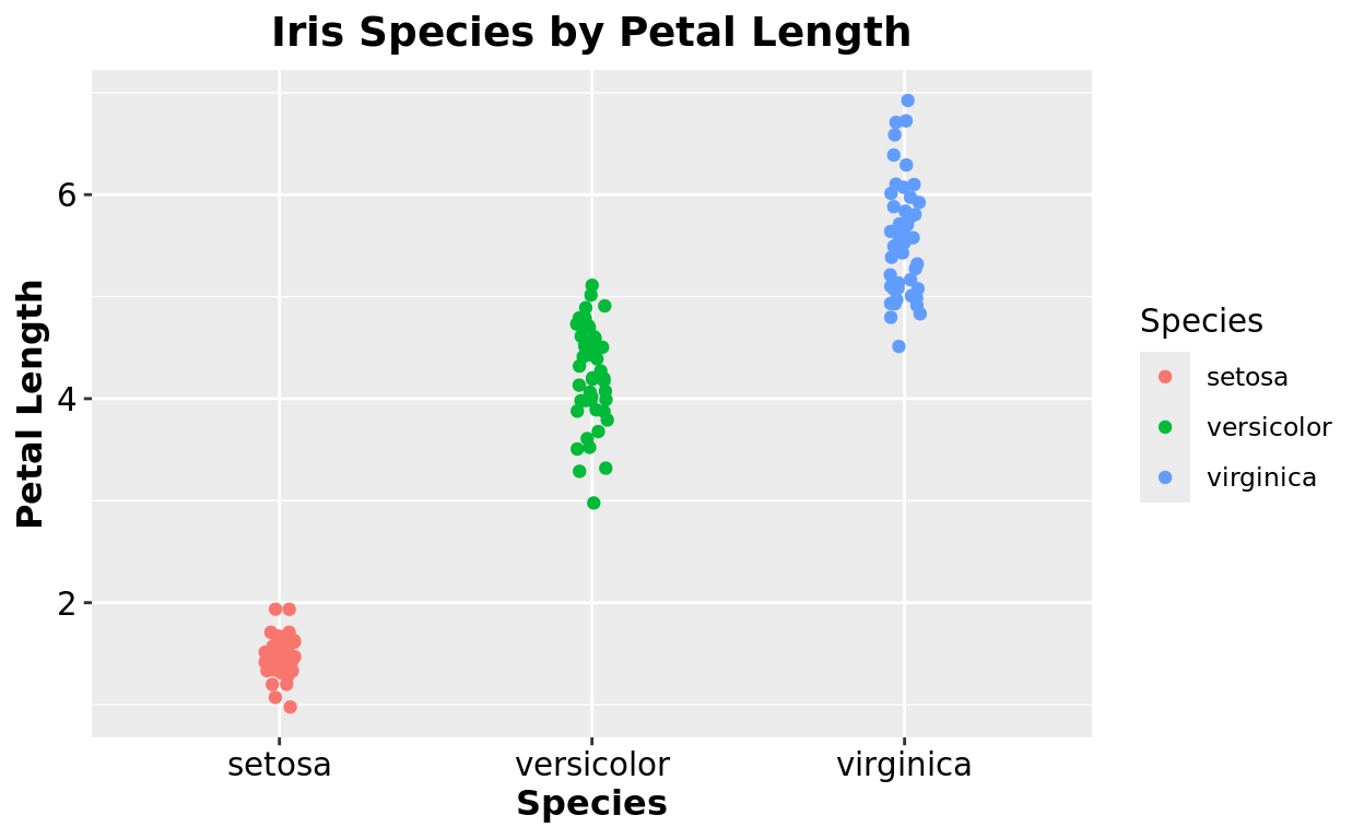
Legend title
If you wish to change the legend title, you can actually do that in labs! But note that it is by identifying the aesthetic it is mapped to.
- If the legend is based on color, then change the title with
color = - If the legend is based on fill color, then change the title with
fill =
ggplot(data = iris, aes(x = Species, y = Petal.Length, color = Species)) +
  geom_jitter(width = 0.05) +
  labs(title = "Iris Species by Petal Length",
       x = "Species",
       y = "Petal Length",
       color = "Look, I changed it!")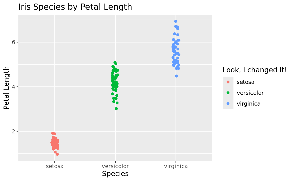
Hide the legend
If you add color to differentiate groups that are already differentiated by the x-axis, it might be sensible to just hide the legend. You can do that as an argument in theme
legend.position = "none"will hide the legend.
ggplot(data = iris, aes(x = Species, y = Petal.Length, color = Species)) +
  geom_jitter(width = 0.05) +
  labs(title = "Iris Species by Petal Length",
       x = "Species",
       y = "Petal Length") +
  theme(legend.position = "none")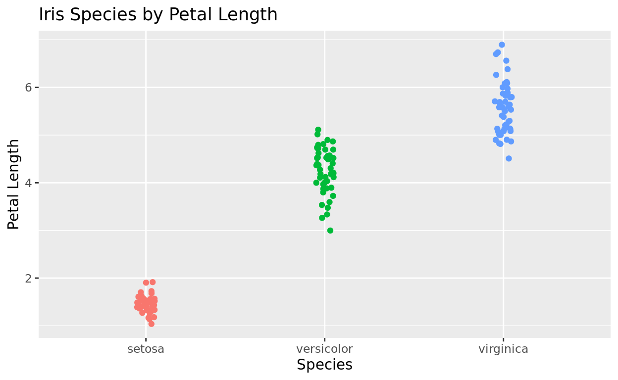
Moving the legend
Or if you just want to place it somewhere else, you can enter “left” “right” “top” or “bottom” to relocate it. Feel free to try out the different options here!
ggplot(data = iris, aes(x = Species, y = Petal.Length, color = Species)) +
  geom_jitter(width = 0.05) +
  labs(title = "Iris Species by Petal Length",
       x = "Species",
       y = "Petal Length") +
  theme(legend.position = "bottom")
See documentation for more
For more on what you can customize with theme, check out the documentation by searching “ggplot2 theme” in a web browser, or going to this link. https://ggplot2.tidyverse.org/reference/theme.html
Try one!
Let’s use the msleep dataset
Let’s create a scatterplot that compares the sleep_rem (x axis) to the sleep_total of mammals in this dataset. We will also color the data by vore classification
Your challenge is to…
- In the
geom_point()line, addsize = 2as an argument to make the points bigger and esaier to see! - Apply the “Set1” color palette from RColorBrewer
- Add the title “Mammal Total Sleep vs. REM Sleep by Diet”
- Apply the
theme_bw()pre-built plot theme. - Use the
themefunction to adjust the title to be centered and bolded
ggplot(data = msleep, aes(x = sleep_rem, y = sleep_total, color = vore)) +
  ...
  ...
  ...
  ...
  ...
ggplot(data = msleep, aes(x = sleep_rem, y = sleep_total, color = vore)) +
geom_point(_________) +
scale_color_____(___________) +
labs(title = _________) +
theme_bw() +
theme(__________)ggplot(data = msleep, aes(x = sleep_rem, y = sleep_total, color = vore)) +
geom_point(size = 2) +
scale_color_brewer(palette = ______) +
labs(title = "Mammal Total Sleep vs. REM Sleep by Diet") +
theme_bw() +
theme(plot.title = element_text(_____________))ggplot(data = msleep, aes(x = sleep_rem, y = sleep_total, color = vore)) +
geom_point(size = 2) +
scale_color_brewer(palette = "Set1") +
labs(title = "Mammal Total Sleep vs. REM Sleep by Diet") +
theme_bw() +
theme(plot.title = element_text(face = "bold", hjust = 0.5))One More thing on themes…
The use of pre-made themes, like theme_bw() or theme_classic(), put them in before enacting customizations with the theme function.
Why? Because the pre-built theme will overwrite any customization options you add with theme. So your tinkering at the customization should always come after!
Scale Functions
Tick Mark Frequency
Scale functions can let you update the numeric frequency or numeric limits of tick marks on your plots.
- Use
scale_x_continuous()to adjust scaling on the x axis - Use
scale_y_continuous()to adjust scaling on the y axis
Breaks
If we want to change the frequency of the tick marks, we would use the breaks argument. Typically, we’ll set breaks equal to a sequence.
- As a reminder,
seq()takes three arguments, we we start, we we end, and the frequency we want.
In the plot we were creating, the y axis defaulted to increments of 2, but let’s try increments of 0.5.
- Since the range spans from about 0 to 8, we’ll
breaks = seq(0,8,0.5)
ggplot(data = iris, aes(x = Species, y = Petal.Length, color = Species)) +
  geom_jitter(width = 0.05) +
  scale_y_continuous(breaks = seq(0,8,0.5))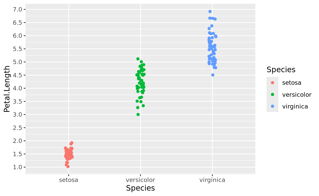
But the axis didn’t start at 0. Why not?
Note that even though we specified the range from 0 to 8, the actual range covered will just go as far as our data falls (about 1 to 8).
If you want to adjust the limits of the axis, use a limits argument!
Limits
limits: It simply takes a vector of 2 values, a minimum and maximum range value, to determine the full scale of that axis.
ggplot(data = iris, aes(x = Species, y = Petal.Length, color = Species)) +
  geom_jitter(width = 0.05) +
  scale_y_continuous(limits = c(0,8))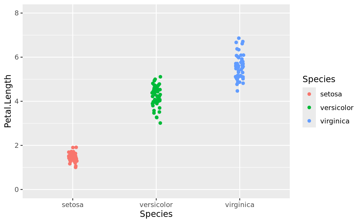
Limits and Scaling
If you want to do both at the same time, add both arguments separated by a comma!
ggplot(data = iris, aes(x = Species, y = Petal.Length, color = Species)) +
  geom_jitter(width = 0.05) +
  scale_y_continuous(breaks = seq(0,8,0.5), limits = c(0,8))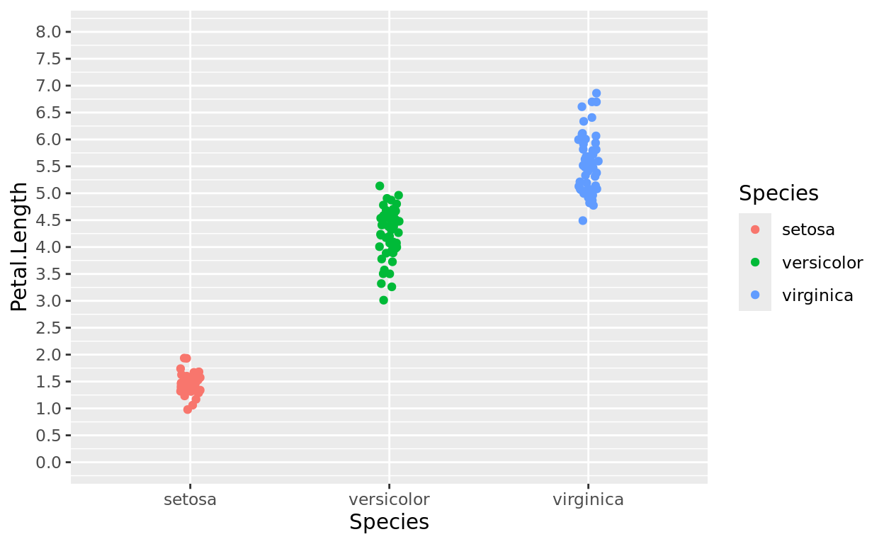
Scaling done wrong
Notice here that I’ll set the limits from 0 to 12, but the tick mark frequency only from 0 to 8. Notice how the tick marks will just stop outside the range defined.
If you use both, make sure you’re careful to choose a scaling that covers the full range (unless you’re using this effect on purpose).
Try fixing this example below!
ggplot(data = iris, aes(x = Species, y = Petal.Length, color = Species)) +
  geom_jitter(width = 0.05) +
  scale_y_continuous(breaks = seq(0,8,1), limits = c(0,12))
Scaling x
You can do the same things with the x axis (should it be numeric). Let’s flip this plot around (and change it to boxplots, because why not). Let’s make the same changes.
ggplot(data = iris, aes(y = Species, x = Petal.Length, fill = Species)) +
  geom_boxplot() +
  stat_boxplot(geom = "errorbar") +
  scale_x_continuous(breaks = seq(0,8,1))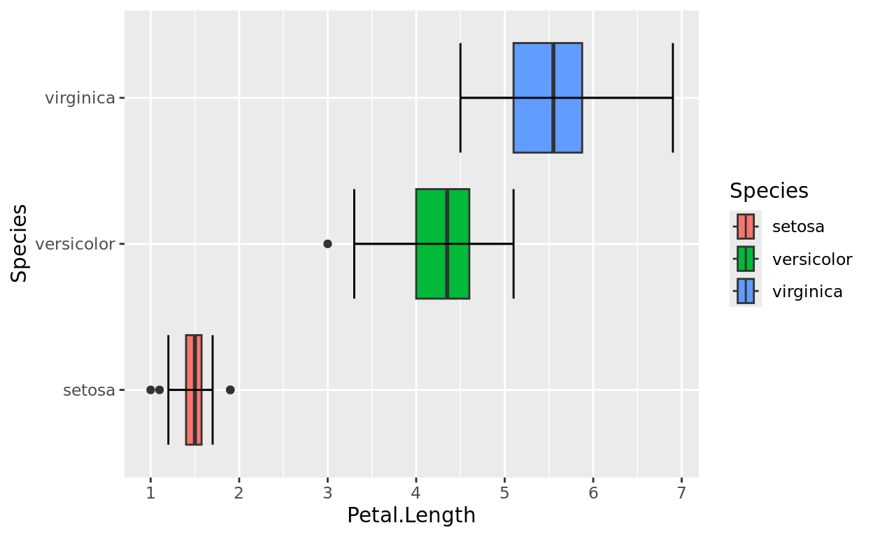
Change the axis!
Let’s revisit the msleep data again. Add scale functions such that:
- the x axis has tick marks by intervals of 0.5
- the y axis has tick marks by intervals of 1
ggplot(data = msleep, aes(x = sleep_rem, y = sleep_total, color = vore)) +
  geom_point(size = 2) +
  labs(title = "Sleep REM vs. Sleep Totals by Diet",
       x = "REM sleep (hrs)",
       y = "Sleep Total (hrs)") +
  theme_bw() +
  scale_color_brewer(palette = "Set1")
ggplot(data = msleep, aes(x = sleep_rem, y = sleep_total, color = vore)) +
geom_point(size = 2) +
labs(title = "Sleep REM vs. Sleep Totals by Diet",
x = "REM sleep (hrs)",
y = "Sleep Total (hrs)") +
theme_bw() +
scale_color_brewer(palette = "Set1") +
scale_x_continuous(breaks = _________) +
scale_y_continuous(__________________)ggplot(data = msleep, aes(x = sleep_rem, y = sleep_total, color = vore)) +
geom_point(size = 2) +
labs(title = "Sleep REM vs. Sleep Totals by Diet",
x = "REM sleep (hrs)",
y = "Sleep Total (hrs)") +
theme_bw() +
scale_color_brewer(palette = "Set1") +
scale_x_continuous(breaks = seq(______)) +
scale_y_continuous(breaks = seq(______))ggplot(data = msleep, aes(x = sleep_rem, y = sleep_total, color = vore)) +
geom_point(size = 2) +
labs(title = "Sleep REM vs. Sleep Totals by Diet",
x = "REM sleep (hrs)",
y = "Sleep Total (hrs)") +
theme_bw() +
scale_color_brewer(palette = "Set1") +
scale_x_continuous(breaks = seq(0,7,0.5)) +
scale_y_continuous(breaks = seq(0,21,1))Return Home
This tutorial was created by Kelly Findley. I hope this was helpful for you!
If you’d like to go back to the tutorial home page, click here: https://stat212-learnr.stat.illinois.edu/