Pipes and Data Wrangling
Tutorial Goals
In this tutorial, we will:
- Introduce the idea of a “pipe” for doing data wrangling using the
dplyrpackage - Use a
filterargument as a way to include or exclude certain rows in our data - Create plots inside our pipe based on the filtering we have done
- Make a summary table using the
summarisefunction andgroup_byin a pipe
Another tidyverse package
ggplot2 is one of many packages in the tidyverse, but let’s talk about another one…
dplyr (usually pronounced as “d plyer”) offers some additional functions that help with “data wrangling.” The name of the package comes from the idea of “plying” data to extract information!
Installed through tidyverse
If you have already installed tidyverse on your computer (or in your RStudio Cloud Project), then you have dplyr installed as well! Just be sure to run library(tidyverse) before using dplyr functions to activate the package.
What is Data Wrangling?
Data wrangling involves basic manipulation with data to prepare for analysis. Some examples include:
- Cleaning data
- Filtering select variables to mask outliers or focus on specific categories.
- Converting a variable type to another data type (e.g., from numeric to categorical)
We’ll largely focus on the second of these things and also do an example of the third as well!
Filtering Numerically
Mini Class Data
Let’s take a look at this small data frame, representing 10 students in a class
ClassIntroducing Pipes
A pipe is the name of pairing two symbols: |>. In many ways, it’s like using + to connect lines of your ggplot. Think of it as an and then statement, where you are proceeding through commands in logical order.
The vertical line | can typically be found over the enter key on your keyboard and may also require you to hold “shift” while pressing it.
Another pipe symbol you might see
Keep in mind that %>% is another pipe symbol you might see in older code. It works exactly the same as |>. But if you use an AI tool to help you write code, you will often see %>% since it is more commonly found in code archives online.
Our goal in words
Perhaps we would like to see students who have at least 1 sibling. We’d like to tell R…
- call on the
Classdataframe (and then) - filter
siblingsto be greater than 0
Our goal in code
Class |>
  filter(siblings > 0)
less/greater than or equal
We can also make a less than or equal to (<=) or greater than or equal to (>=) argument.
Class |>
  filter(siblings >= 1)
Try it!
Use a filter argument in a pipe to output only students who are less than 67 inches tall.
Class |>
  ______________
Class |>
filter(height _____)Filtering Categorically
Filter by academic level
The above examples involve filtering numeric variables, but we can also filter to include/exclude various levels of a categorical variable.
For example, what if we only wanted to select students who were Freshman from the class?
Class |>
  filter(acad_level == "Freshman")
How did we set that up?
In R, think of the double equals (==) as like saying “matches.”
In the previous example, we might read that as acad_level matches Freshman.
Also notice we need quotation marks around Freshman. To select specific names, use quotation marks. To filter down to value ranges, no quotation marks needed.
Does NOT match this category
We might also choose to simply exclude one category. We can do that with != which you should read as “Does not match.”
How would we select all students that are not a Sophomore?
Class |>
  filter(acad_level __ ____________)
Class |>
filter(acad_level != ____________)Class |>
filter(acad_level != "Sophomore")Watch for cAsE and exact letter matches
I hope you were successful to notice we needed to select Sophomore rather than Sophomores (plural) or sophomore (lowercase).
R is case sensitive, as well as sensitive to any small change to the exact way it is recorded in the data!
Multiple Filter Commands
“And” statements
With filter, I can also implement multiple commands at once using the & symbol. Perhaps we want to include students that are Juniors AND that have at least 1 sibling.
Class |>
  filter(acad_level == "Junior" & siblings > 0)
“Or” statements
Likewise, we can also use the | symbol to make an or statement. It is both one component of our pipe symbol and a stand-alone logic symbol!
How about students that are Juniors OR are at least 68 inches tall.
Class |>
  filter(acad_level == "Junior" | height >= 68)
“In” statements
What if I want Freshmen and Sophomores? We can’t select just one, or all but one. Instead, we can use %in% and then list our categories of interest in a vector.
Class |>
  filter(acad_level %in% c("Freshman", "Sophomore"))
Practice
I would like a list of all students who are more than 67 inches tall, but not Dan (no offense to “Dan’s” out there!). How might I do that?
Class |>
  filter(____________________)
Class |>
filter(height > 67 & ___________)Class |>
filter(height > 67 & name != "Dan")Plotting within a pipe
New example: Midwest data
Let’s transition to a larger dataframe now!
In the midwest dataframe, each row represents a county in one of five states: Illinois, Indiana, Michigan, Ohio, or Wisconsin.
midwestLooking at poptotals
Perhaps we want to compare county geographic areas for Illinois and Wisconsin. But if we try to plot first, we’re going to get all 5 states included
ggplot(data = midwest, aes(x = state, y = area, color = state)) +
  geom_jitter(width = 0.05)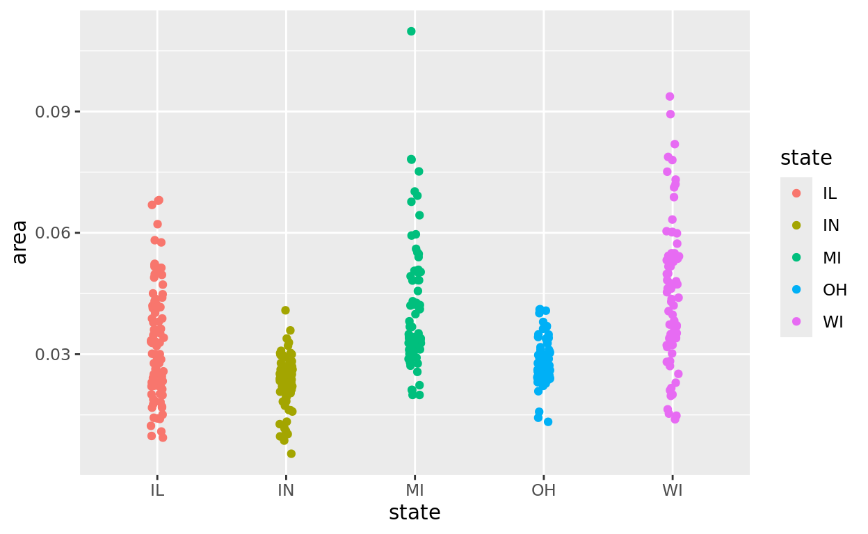
Plotting inside a pipe
What we want to do first is filter to only include IL and WI counties.
In the following code, we do the following - Call on midwest (and then) - Filter to only include counties in IL or WI (and then) - plot the data
And notice that we exclude the data argument in the plot since it is already listed to start the pipe.
midwest |>
  filter(state %in% c("IL", "WI")) |>
  ggplot(aes(x = state, y = area, color = state)) +
  geom_jitter(width = 0.05)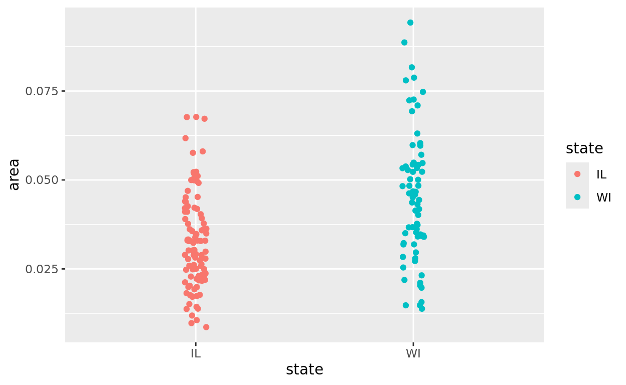
Wait, why is there no second data argument?
Because the data argument is already out front with a pipe. If you make the data argument again, R may ignore the filtering done first and assume you are starting over. Or in some cases, R may just output in error.
Masking outliers
Another useful application of plotting in a pipe is masking outliers. For example, maybe we want to compare county population sizes after excluding the highly urban counties like Cook County (Chicago area) to better see how most counties compare.
midwest |>
  filter(state %in% c("IL", "WI")) |>
  ggplot(aes(x = state, y = poptotal, color = state)) +
  geom_jitter(width = 0.05)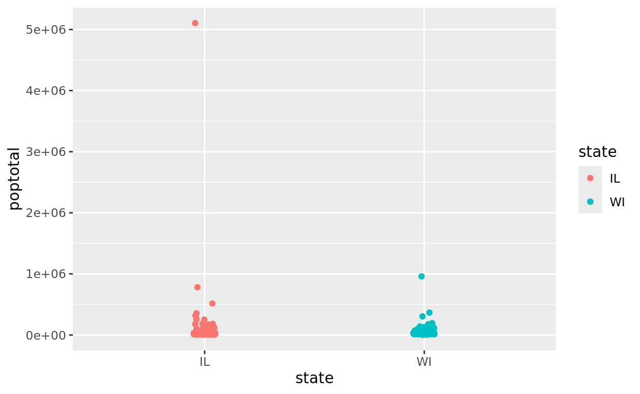
A second filter argument
Let’s complete another pipe that keeps our two state comparison, but also filters to only include county populations below 500,000. Be careful to report the value in the filter without commas!
midwest |>
  filter(state %in% c("IL", "WI") & poptotal < 500000) |>
  ggplot(aes(x = state, y = poptotal, color = state)) +
  geom_jitter(width = 0.05)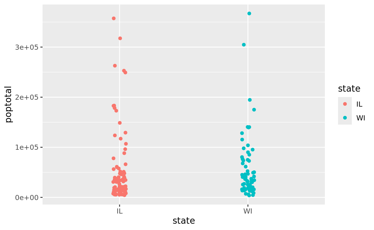
Summary Tables
Using summarise
Let’s change gears–perhaps we’d like to compare county populations across states. One measure of interest might be comparing mean county populations.
Before comparing states, notice how we might calculate a mean all by itself inside a pipe.
midwest |>
  summarise(mean(poptotal))
More summarise arguments
We could similarly calculate other summary statistics. We just need to separate them by commas.
It’s also more readable to put each on a different line, so we will do that from here on!
A few examples:
meanfinds the meanmedianfinds the mediansdfinds the standard deviationmaxfinds the maximumminfinds the minimumlengthfinds the number of observations
midwest |>
  summarise(mean(poptotal),
            median(poptotal),
            sd(poptotal),
            max(poptotal),
            min(poptotal),
            length(poptotal))
Naming the columns
Those are probably not very attractive column headers. Let’s give them some nicer names. No spaces though, as these are like dataframe column headers!
midwest |>
  summarise(Mean = mean(poptotal),
            Median = median(poptotal),
            St_Dev = sd(poptotal),
            Max = max(poptotal),
            Min = min(poptotal),
            Count = length(poptotal))
Creating a summary table
But the real power of piping comes in creating and comparing summary measures across groups. We can add a group_by statement first to communicate that we wish to generate and compare these measures across states.
midwest |>
  group_by(state) |>
  summarise(Mean = mean(poptotal),
            Median = median(poptotal),
            St_Dev = sd(poptotal),
            Max = max(poptotal),
            Min = min(poptotal),
            Count = length(poptotal))
Interpret the results!
Some observations we might make from the previous table include:
- Illinois has the highest standard deviation in county populations–likely because it has by far the highest single county population of 5,105,067.
- Illinois also has the highest number of counties at 102, and Wisconsin the lowest at 72.
- Ohio has the highest mean county population and the highest median county population.
- Michigan has the smallest county by population–there’s a Michigan county with a population of only 1,701.
Rounding your statistics
If you wanted to adjust how much those values round to, you can use a round function around your statistics.
Note that round takes two arguments
- The value (or in our case, a summarizing function),
- The digits argument.
Use digits to communicate how much to round
- digits = 0 rounds to a whole number
- digits = 2 would round to 2 decimal places
- digits = -2 would round to the 100s place
a = 175.428

round(a, digits = 1)
## [1] 175.4round(a, digits = 0)## [1] 175round(a, digits = -1)## [1] 180Try it with Midwest
Round the values in our summary table to the 100s place.
midwest |>
  group_by(state) |>
  summarise(Average = round(mean(poptotal), digits = __),
            St_Dev = _____(sd(poptotal), digits = __))
midwest |>
group_by(state) |>
summarise(Average = round(mean(poptotal), digits = -2),
St_Dev = round(sd(poptotal), digits = -2))Changing Variable Type
Variable types
When importing data, R will make assumptions about whether your variable should be treated as a “character” variable (what we might think of as categorical) or a “numeric” variable. Basically, if a column only has numeric entries, it will be stored and treated as a numeric variable.
An example
In cases where we have a numeric variable, but actually want to treat it categorically, we might ask R to change it to a categorical variable.
A classic example might be a rating scale. For example, in our class data, the last variable is each student’s rating of how much they like math on a scale of 1 to 3.
ClassUsing as.character()
One easy fix is to wrap our variable reference in an as.character function. This will convert the variable to a character (categorical) variable.
Now, I could make something like side-by-side boxplots with the rating score as a categorical variable.
ggplot(data = Class, aes(x = as.character(math_rating), y = height, fill = as.character(math_rating))) +
  geom_boxplot() +
  labs(x = "Math Rating", y = "Height (in)", fill = "Math Rating")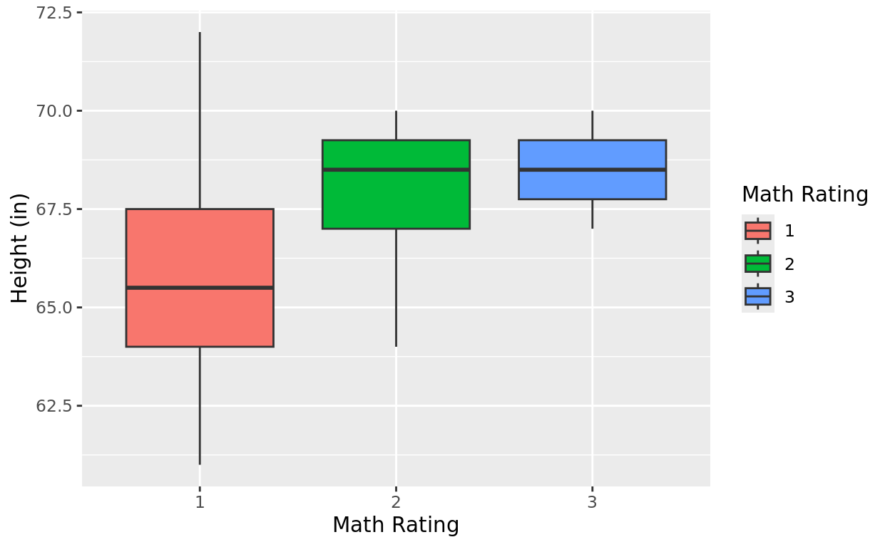
Universal variable change
If you plan to use the variable repeatedly, you might try running a universal code.
That first line of code won’t output a result, but by running str() with our dataframe, we can see that math_rating is now a character variable (“chr”) rather than numeric (“num”).
Class$math_rating = as.character(Class$math_rating)
str(Class)
## 'data.frame': 10 obs. of 5 variables:
## $ name : chr "Dan" "Mimi" "Courtney" "Rami" ...
## $ height : num 70 65 64 68 72 67 66 69 70 61
## $ acad_level : chr "Freshman" "Junior" "Junior" "Sophomore" ...
## $ siblings : num 2 0 2 3 1 4 1 6 4 0
## $ math_rating: chr "3" "1" "2" "2" ...Removing NAs
Comparing penguin species
Let’s say we wanted to compare penguin species by flipper length. But notice what happens in this scenario:
penguins |>
  group_by(species) |>
  summarise(Mean = mean(flipper_length_mm),
            SD = sd(flipper_length_mm))
What happened?
The penguins data had a few cells with missing data. As a result, if we tried calculating summary measures from variables with empty cells, we might see some “NA” results indicating that.
penguinsna.rm = TRUE
To get around this, we can add an argument inside our statistical measures. na.rm = TRUE simply indicates to R to remove NAs when making these calculations. Thus, we’ll find the summary measures of the data that is reported.
penguins |>
  group_by(species) |>
  summarise(Mean = mean(flipper_length_mm, na.rm = TRUE),
            SD = sd(flipper_length_mm, na.rm = TRUE))
Excluding rows that have NAs
Another situation we may encounter is wanting to exclude rows that have any NAs in them.
We can do that with the filter function and the setting our variable to not match NA. For example
msleep |>
  filter(vore != "NA") |>
  ggplot(aes(x = vore, y = sleep_total, fill = vore)) +
  geom_boxplot() +
  labs(x = "Diet Type", y = "Total Sleep (hours)", fill = "Diet Type")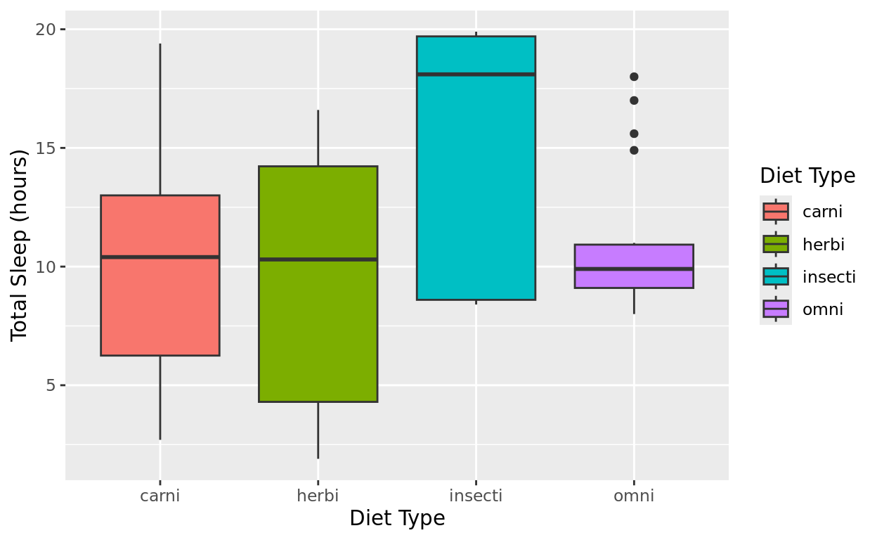
Want to learn more?
We only scratched the surface of data wrangling with dplyr. If you’re interested in learning more, check out the RStudio cheatsheet (you can find all tidyverse cheatsheets here: https://www.rstudio.com/resources/cheatsheets/)
Here is another very accessible discussion of the features we learned, plus a few more: https://cran.r-project.org/web/packages/dplyr/vignettes/dplyr.html
Return Home
This tutorial was built by Kelly Findley. I hope this experience was helpful for you!
If you’d like to go back to the tutorial home page, click here: https://stat212-learnr.stat.illinois.edu/