Boxplots Revisited
Tutorial Goals
In this tutorial, we’ll focus more on representing multiple variables together in one plot. In particular, we’ll talk about:
- Boxplots: 1 categorical variable with 1 numeric variable (focusing on comparing summary measures)
- Overlapping densities: 1 categorical variable with 1 numeric variable (but with each group overlaid!)
- Jitterplots: 1 categorical variable with 1 numeric variable (comparing all data points)
- Stacked Barplots: 2 categorical variables
- Scatterplots: 2 numeric variables
- A quick guide to customizing the order of levels for a categorical variable
The Palmer Penguins Data
We’re going to investigate the penguins data stored in the palmerpenguins package for several of these plots.
library(palmerpenguins)
penguins
Comparing species
This data represents penguins from the Palmer Archipelago. Penguins were all identified from one of three species (and they are all adorable):
Comparing Species across Flipper Length
One variable we can compare these penguins against is their flipper length. Let’s do that with side by side boxplots.
ggplot(data = penguins, aes(x = species, y = flipper_length_mm, fill = species)) +
  geom_boxplot() +
  stat_boxplot(geom = "errorbar") +
  labs(x = "Species", y = "Flipper Length (mm)", title = "Flipper Length of Different Species")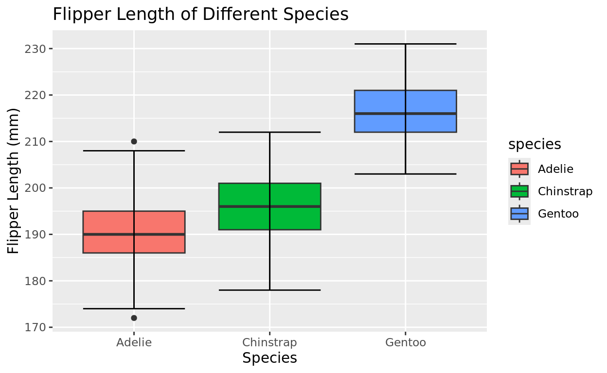
Boxplots vs. other options
As a reminder, boxplots are good for quick comparisons of groups using summary values (5-number summary). But there are other options if we wish to see more of the distribution.
Overlapping Density Curves
Introduction
Overlapping density curves are a fun alternative to represent distributions all in the same plane.
Visualizing a fuller distribution
You might remember the geom_density option. We will again assign a numeric variable to the x axis (like histogram, the y axis is used to compare how many units are relatively in each x axis zone).
ggplot(data = penguins, aes(x = flipper_length_mm)) +
  geom_density(fill = "orchid")
## Warning: Removed 2 rows containing non-finite outside the scale range
## (`stat_density()`).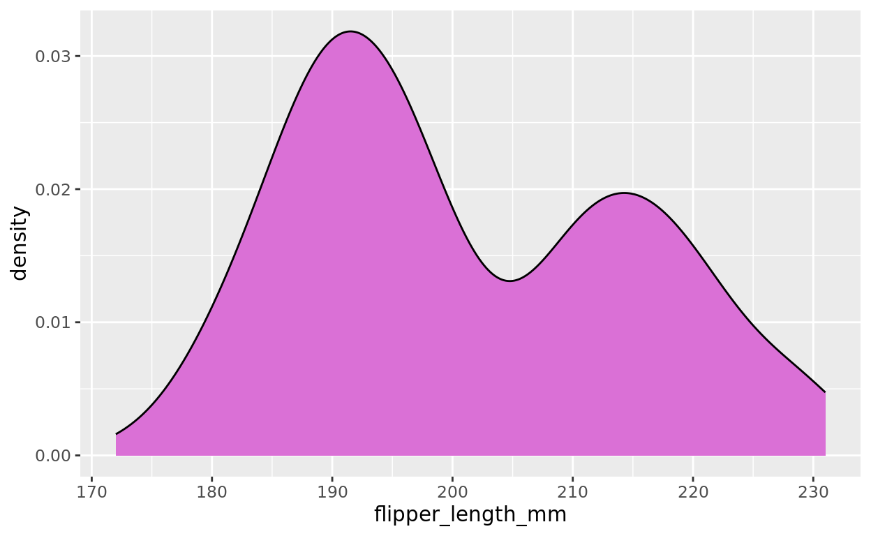
Looking at Flipper Length separated by Species
But now, let’s take advantage of the fill argument as a representation for another variable. Let’s assign the species as a fill color so we can compare the flipper length distributions of each species
ggplot(data =penguins, aes(x = flipper_length_mm, fill = species)) +
  geom_density()
## Warning: Removed 2 rows containing non-finite outside the scale range
## (`stat_density()`).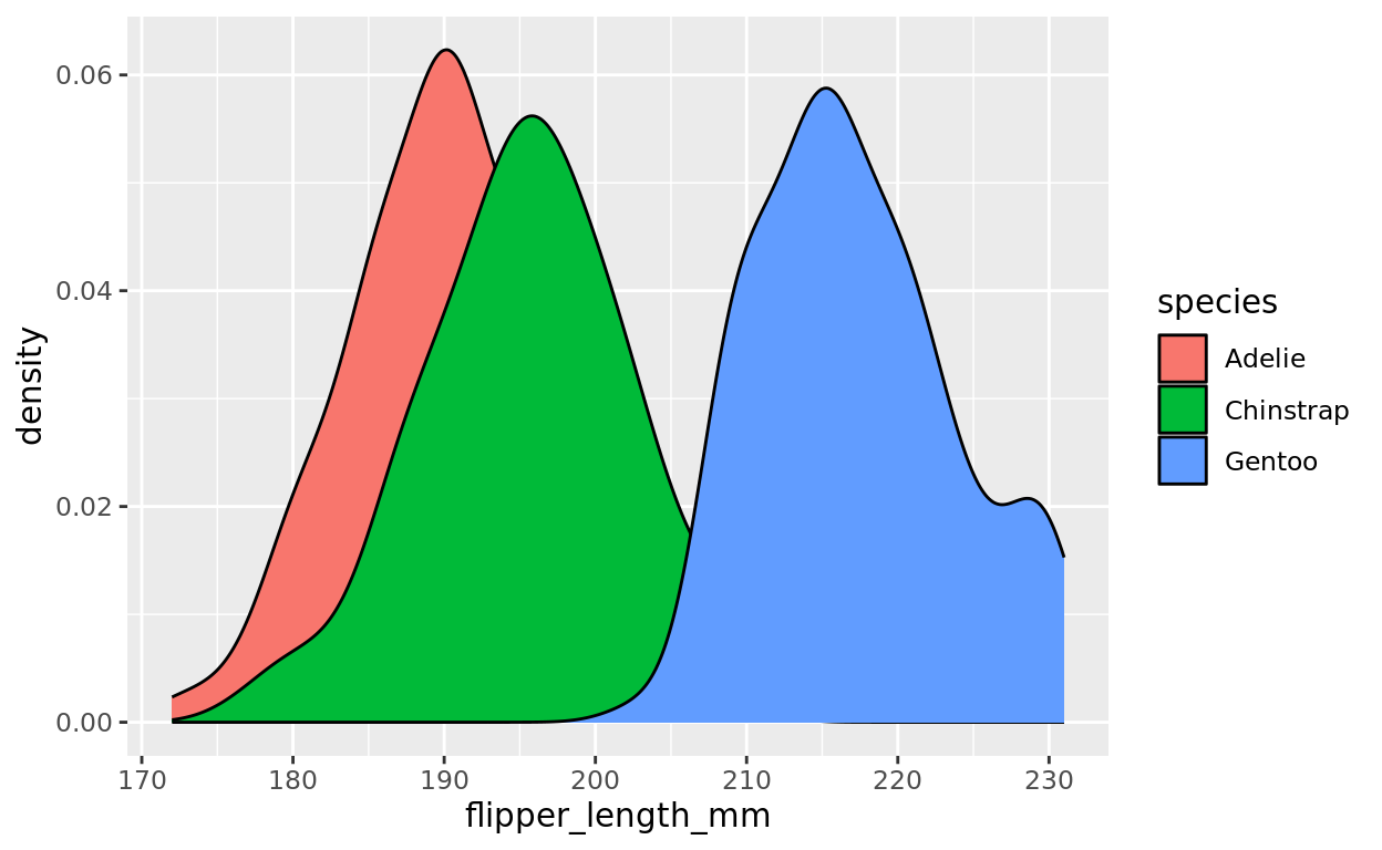
Adding Transparency with Alpha
You’ll notice that when we add overlap, it’s difficult to see the whole story. We should add some transparency to this graph using alpha. Remember that alpha set to 0 is fully transparent, and alpha set to 1 is fully opaque. I plugged in 0.4, but experiment with different values!
ggplot(data =penguins, aes(x = flipper_length_mm, fill = species)) +
  geom_density(alpha = 0.4)
Diamond Prices by Cut
The fllpper length distributions are fairly symmetric, but density curves might reveal interesting distributional patterns that are difficult to see with boxplots. For example, consider how the time until a patient breathes unassisted might vary based on which anaesthetic (A, B, C, or D) they were given.
Here, the skewness and nuances of these distributions might not be as clear when using a boxplot.
ggplot(data = anaesthetic, aes(x = breath, fill = tgrp)) +
  geom_density(alpha = 0.3)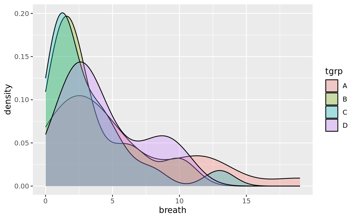
Jitter plots
Another group comparison
Jitter plots are also appropriate for comparing a grouping variable with a numeric variable, but they will actually plot the individual data, rather than just summary values or distributional shape.
When to use
Jitter plots are often a good choice when plotting all of the data is reasonable. Boxplots and overlapping densities are often better representations for larger datasets.
There’s an optional tutorial at the bottom of the R Tutorials Page that covers how to add multiple geometries in the same plot.
Using the point geom
Let’s visualize the same example, but now we will use the geom_point() representation. But you’ll notice this plot is not as visually clear as it could be.
ggplot(data = penguins, aes(x = species, y = flipper_length_mm)) +
  geom_point() +
  labs(x = "Species", y = "Flipper Length (mm)", title = "Flipper Length of Different Species")
## Warning: Removed 2 rows containing missing values or values outside the scale range
## (`geom_point()`).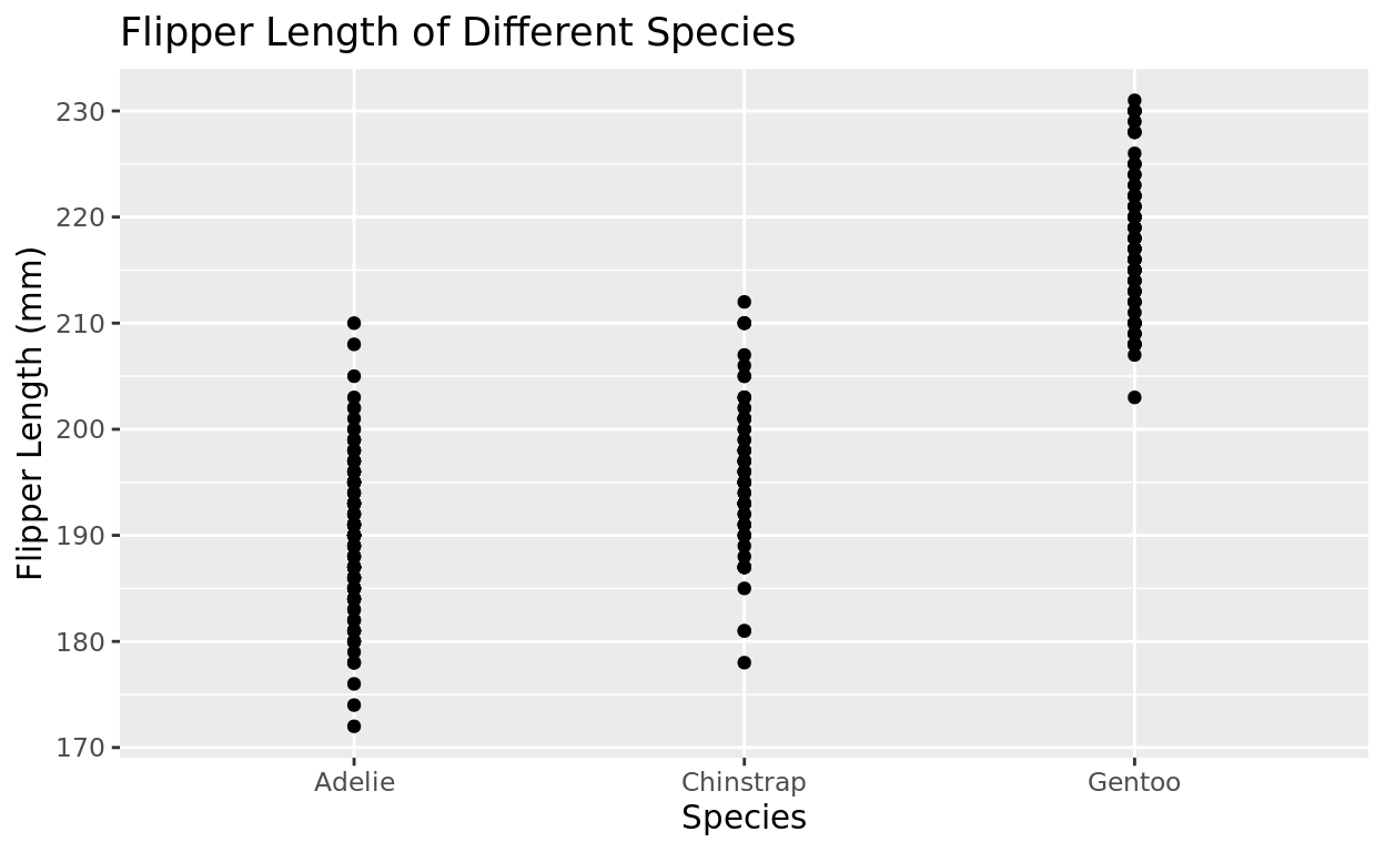
Warning Message
You might have noticed the warning message that two rows were removed for missing values. That just means we were missing data for two penguins for at least one of the variables we asked for.
That’s ok and expected with many datasets we use that have some missing entries!
Keep in mind that Warning messages are just informational. Error messages are what signal that something is broken and likely needs to be fixed.
Jittering
The problem is that many points are overlapping, making it harder to see density.
Let’s try using geom_jitter in place of geom_point
ggplot(data = penguins, aes(x = species, y = flipper_length_mm)) +
  geom_jitter() +
  labs(x = "Species", y = "Flipper Length (mm)", title = "Flipper Length of Different Species")
## Warning: Removed 2 rows containing missing values or values outside the scale range
## (`geom_point()`).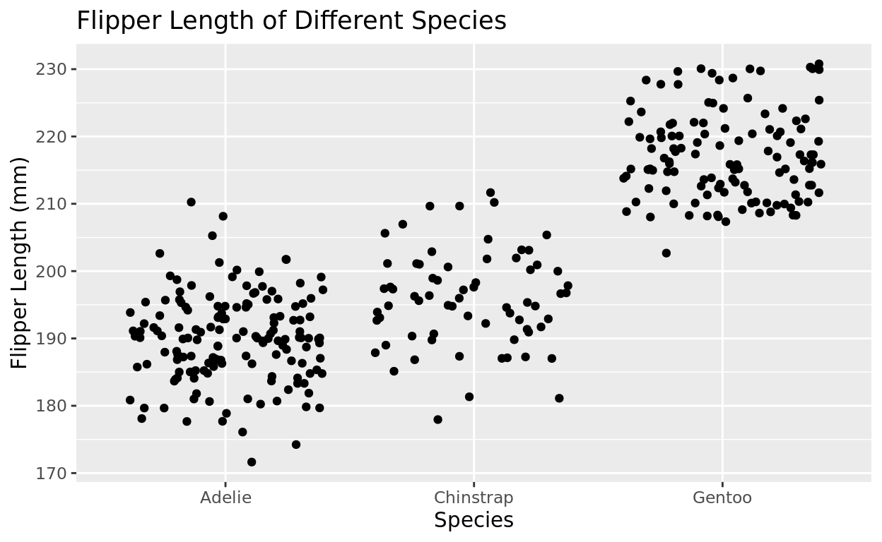
Adjust the jitter width
This is probably too much jittering! Let’s try limiting how wide the values jitter by adding a width argument. I would choose something between maybe 0.05 and 0.15, but you can adjust to whatever looks good!
ggplot(data = penguins, aes(x = species, y = flipper_length_mm)) +
  geom_jitter(width = 0.1) +
  labs(x = "Species", y = "Flipper Length (mm)", title = "Flipper Length of Different Species")
Add color
Just with the other representations, we could differentiate by color as well! But unlike boxplots and violin plots, the argument won’t be fill, but instead it will be color!
ggplot(data = penguins, aes(x = species, y = flipper_length_mm, color = species)) +
  geom_jitter(width = 0.1) +
  labs(x = "Species", y = "Flipper Length (mm)", title = "Flipper Length of Different Species")
## Warning: Removed 2 rows containing missing values or values outside the scale range
## (`geom_point()`).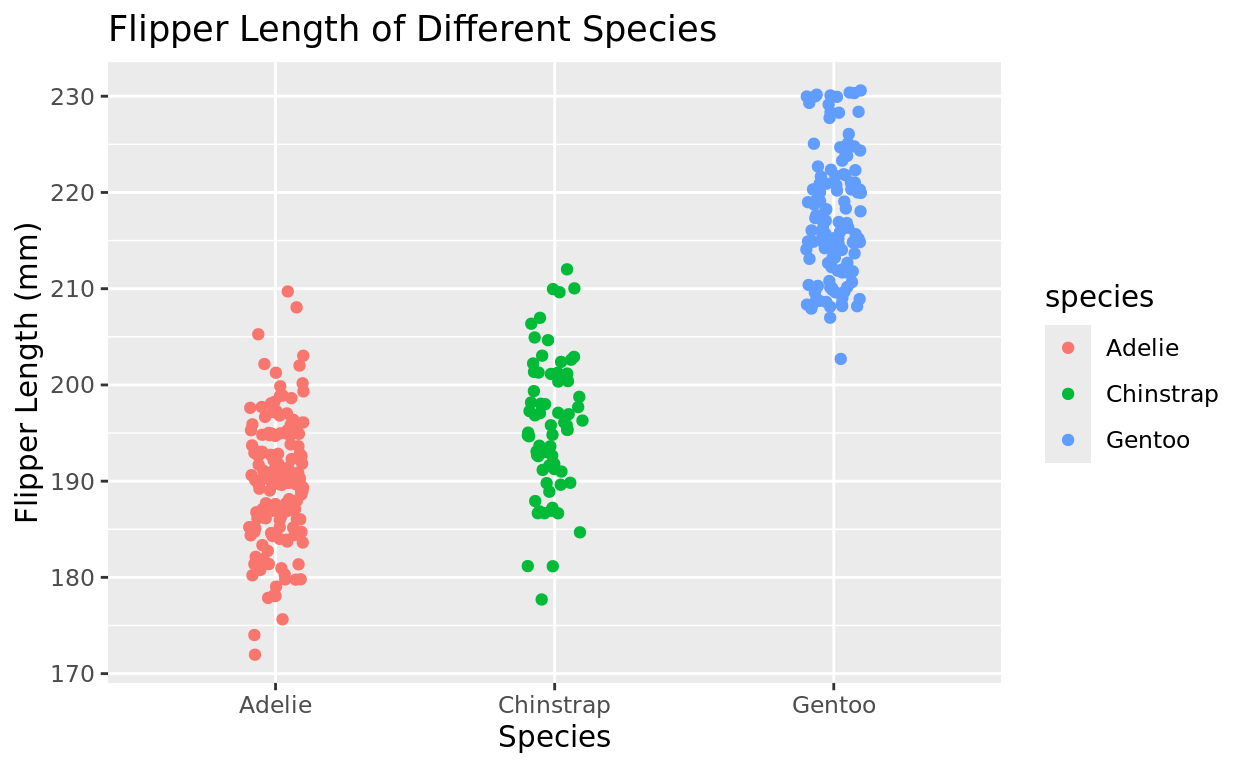
OPTIONAL: You could add a mean bar
The stat_summary function can help you plot a summary measure, like a mean bar, for more information!
This setup is a little complicated, and you won’t need it in your lab, but I wanted to show you in case you’d like to try it on your own.
Add stat_summary line to your plot, and then identify mean as your function. The color, width, and size can all easily be adjusted, but the first few arguments would need to stay as is.
ggplot(data = penguins, aes(x = species, y = flipper_length_mm, color = species)) +
  geom_jitter(width = 0.05) +
  stat_summary(fun = mean, fun.min = mean, fun.max = mean, geom = "errorbar", color = "black", width = 0.2, linewidth = 1.5) +
  labs(x = "Species", y = "Flipper Length (mm)", title = "Flipper Length of Different Species")
## Warning: Removed 2 rows containing non-finite outside the scale range
## (`stat_summary()`).## Warning: Removed 2 rows containing missing values or values outside the scale range
## (`geom_point()`).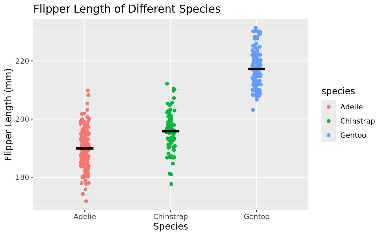
Simple and Stacked Barplots
Simple barplot
A barplot for just one variable can count up how many observations we have for each group in a categorical variable.
How many penguins do we have of each species?
ggplot(data = penguins, aes(x = species)) +
  geom_bar() +
  labs(x = "Species", title = "Counts for each Species")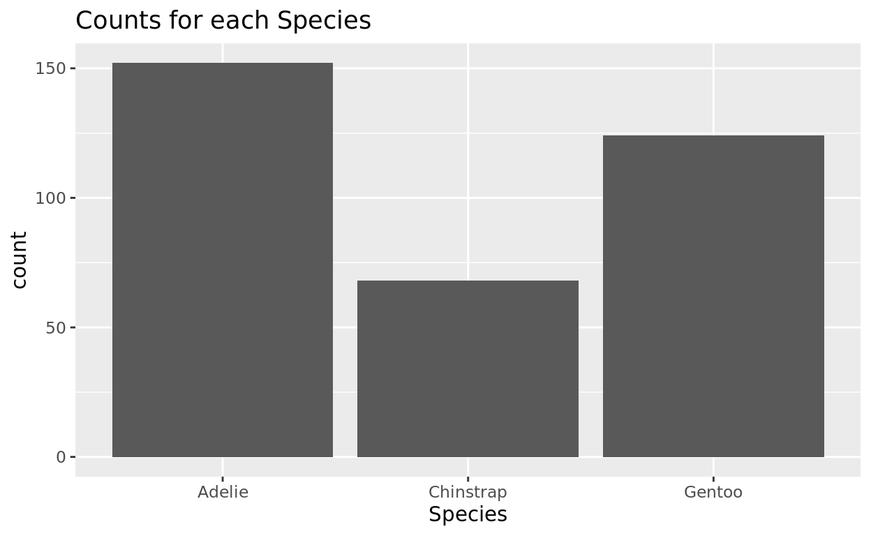
Table Function
We could also use the table function to get more precise counts too. Just use the function table and input the categorical variable that you wish to run frequencies for.
table(penguins$species)##
## Adelie Chinstrap Gentoo
## 152 68 124Adding in some color
And if we want to add some fill color to each bar, we can also fill by speces too! And then I’ll also add a black border color to make it look cleaner.
ggplot(data = penguins, aes(x = species, fill = species)) +
  geom_bar(color = "black") +
  labs(x = "Species", title = "Counts for each Species")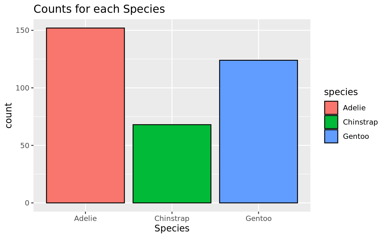
Representing Multiple categories
Another variable collected was the island in which the penguin was observed on. Were the penguins of each species evenly distributed across islands, or did each species show up more often on a certain island?
Let’s try creating a different bar for each island and then seeing that island’s composition by species. We can do that by assigning species as a fill color.
ggplot(data = penguins, aes(x = island, fill = species)) +
  geom_bar(color = "black") +
  labs(x = "Island", fill = "Species", title = "Species Representation by Island")
Leukemia and X-rays
Let’s look at another example: is there a connection between children who have x-rays and the development of acute myeloid leukemia?
- This dataset called
amlxrayrecords medical information for 238 children - The
diseasecolumn reports presence of leukemia - The
Craycolumn reports whether this child had previously had an x-ray
amlxrayStarting with Univariate
Let’s first make a simple plot just seeing how many children in this sample have had an x-ray
- Fill each bar based on status
- Add a black border color.
ggplot(data = ____________, aes(_______________)) +
  geom_bar(___________) +
  labs(x = "Had X-ray", title = "How many children had X-rays")
ggplot(data = amlxray, aes(x = ___________, fill = _________)) +
geom_bar(color = ___________) +
labs(x = "Had X-ray", title = "How many children had X-rays")ggplot(data = amlxray, aes(x = Cray, fill = Cray)) +
geom_bar(color = "black") +
labs(x = "Had X-ray", title = "How many children had X-rays")Pairing with disease status
Let’s try creating a stacked bar plot to see if the proportion of children with leukemia in each group might be different. Let’s keep Cray on the x axis, but now try adding disease as a fill color.
Since the labs function is quite long, I have created new lines for each argument to make it easier to read.
ggplot(data = amlxray, aes(_______________)) +
  geom_bar(color = "black") +
  labs(x = "Had X-ray",
       fill = "Leukemia Diagnosis",
       title = "Relationship between X-rays and Leukemia Diagnosis")
ggplot(data = amlxray, aes(x = ___________, fill = _________)) +
geom_bar(color = "black") +
labs(x = "Had X-ray",
fill = "Leukemia Diagnosis",
title = "Relationship between X-rays and Leukemia Diagnosis")ggplot(data = amlxray, aes(x = Cray, fill = disease)) +
geom_bar(color = "black") +
labs(x = "Had X-ray",
fill = "Leukemia Diagnosis",
title = "Relationship between X-rays and Leukemia Diagnosis")100% Stacked
It would be much easier to compare these proportions if we instead scaled each bar to be the same height, rather than preserving the counts.
Add position = "fill" into the geom line to make this 100% stacked!
Also note that since the y-axis is no longer a count, we might choose to label this now as a proportion.
ggplot(data = amlxray, aes(x = Cray, fill = disease)) +
  geom_bar(color = "black", position = "fill") +
  labs(x = "Had X-ray",
       y = "Proportion with Leukemia Diagnosis",
       fill = "Leukemia Diagnosis",
       title = "Relationship between X-rays and Leukemia Diagnosis")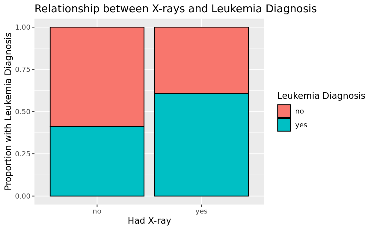
Adjust width
Sometimes with only 2 bars, it looks nicer to narrow the width. We can do that with a width argument inside the geom_bar line.
You can change the width of boxplots using the same argument by the way!
ggplot(data = amlxray, aes(x = Cray, fill = disease)) +
  geom_bar(color = "black", position = "fill", width = 0.5) +
  labs(x = "Had X-ray",
       y = "Proportion with Leukemia Diagnosis",
       fill = "Leukemia Diagnosis",
       title = "Relationship between X-rays and Leukemia Diagnosis")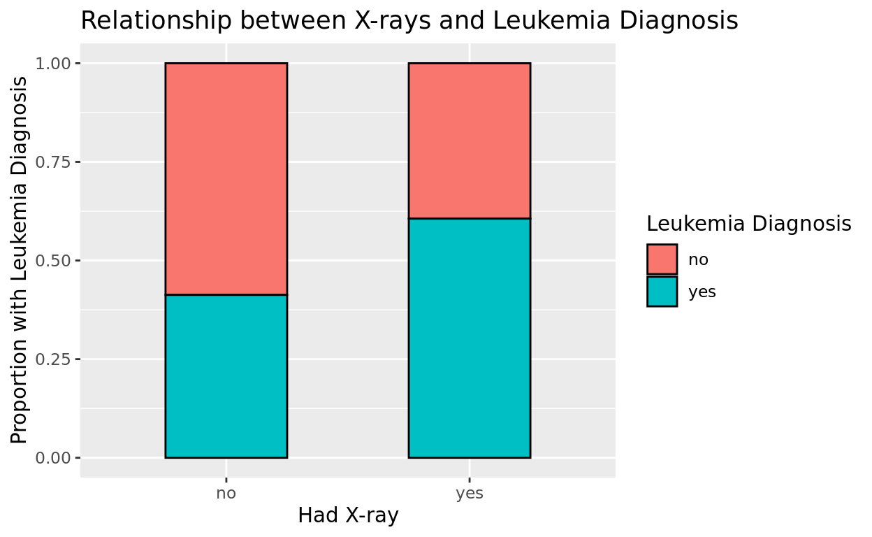
What do you think?
It does seem like the children with x-rays have a higher incidence of leukemia! Whether the x-ray is causing the leukemia is a deeper question we can’t answer with this alone! We might want to stratify this relationship by some other possible confounders.
Clustered Barplots (also called “Dodged” Barplots)
If we want to more directly compare within a bar, we can break up the bars into a cluster. Let’s try that by now doing position = "dodge" rather than position = "fill"
ggplot(data = amlxray, aes(x = Cray, fill = disease)) +
  geom_bar(position = "dodge", color = "black") +
  labs(x = "Had X-ray",
       fill = "Leukemia Diagnosis",
       title = "Relationship between X-rays and Leukemia Diagnosis")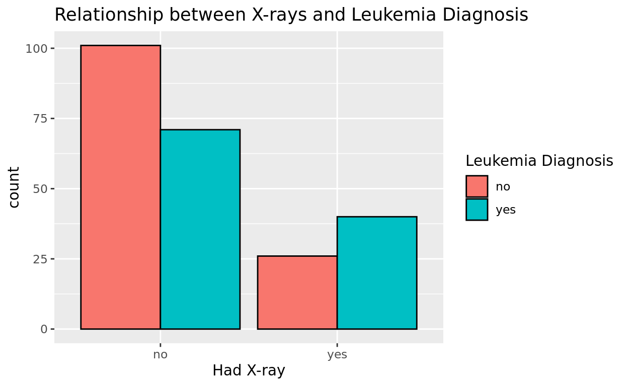
This provides another way to see the same data! Comparing the height of the bars in each cluster relative to one another shows how proportions vary a bit across each cut quality.
Scatterplots
Introduction
Scatterplots are helpful for looking at the potential relationship between two numeric variables.
First Scatterplot
Let’s look at penguins again!
Is there an association between the body mass (body_mass_g) and the flipper length (flipper_length_mm) of penguins in our dataset?
We’ll use the geom_point option again…but this time with two numeric variables, we’ll get points scattered across the plane instead of column groupings.
ggplot(data = penguins, aes(x = body_mass_g, y = flipper_length_mm)) +
  geom_point() +
  labs(x = "Body Mass (g)",
       y = "Flipper Length (mm)")
What do we see?
The plot makes sense. Penguins with higher body mass tend to have longer flippers. But there is still a bit of variability in this relationship.
Body mass isn’t the only thing that determines flipper length, but it does seem to be a pretty good predictor!
Choose a single color
If we don’t want to go with the generic black, we can also add a singular color option in geom_point(). Notice again that with points, it needs to be color = rather than fill =. It’s easy to mix that up, so try to remember that with points!
ggplot(data = penguins, aes(x = body_mass_g, y = flipper_length_mm)) +
  geom_point(color = "purple") +
  labs(x = "Body Mass (g)",
       y = "Flipper Length (mm)")
Alpha (transparency) + Size
You can also change the level of transparency within your scatterplot which is denoted by alpha
- Alpha spans from 0 (fully transparent) to 1 (fully opaque)
- Changing this value can help us reveal more of the density of the data when it is heavily clustered (as it is here!)
We might also choose to change the size of the dots. Since we’re adding some transparency, let’s try by making the dots a bit bigger as well!
ggplot(data = penguins, aes(x = body_mass_g, y = flipper_length_mm)) +
  geom_point(color = "purple", alpha = 0.4, size = 2) +
  labs(x = "Body Mass (g)",
       y = "Flipper Length (mm)")
Jitter vs. Point
In some cases, we might even change the geometry from geom_point to geom_jitter to add some jittering to the points. This is especially helpful if we have a lot of points that are overlapping, which can make it hard to see the density of the data.
When we do, you can choose to jitter with height or with width (or both!). Just be careful that the jitter amount you choose is consistent with the numeric scale.
In this example, since flipper length’s scale isn’t too wide (going by 10’s in our tick marks), I should probably jitter in height no more than about 1 so as not to make the data look too spread out. If I jittered by 10, it would be very difficult to interpret the plot!
ggplot(data = penguins, aes(x = body_mass_g, y = flipper_length_mm)) +
  geom_jitter(color = "purple", alpha = 0.4, size = 2, height = 1) +
  labs(x = "Body Mass (g)",
       y = "Flipper Length (mm)")
Best fit line?
We will talk about this more later, but with scatterplots, we may also choose to add a best fit line to better see what the trend might be. We can do this by adding a geom_smooth line to our code.
In this code, method = "lm" tells R to use a linear model to fit the line, and se = FALSE tells R not to plot the confidence interval around the line (which can be helpful for visual clarity, but is optional).
ggplot(data = penguins, aes(x = body_mass_g, y = flipper_length_mm)) +
  geom_point(color = "purple", alpha = 0.4, size = 2) +
  labs(x = "Body Mass (g)",
       y = "Flipper Length (mm)") +
  geom_smooth(method = "lm", se = FALSE, color = "red")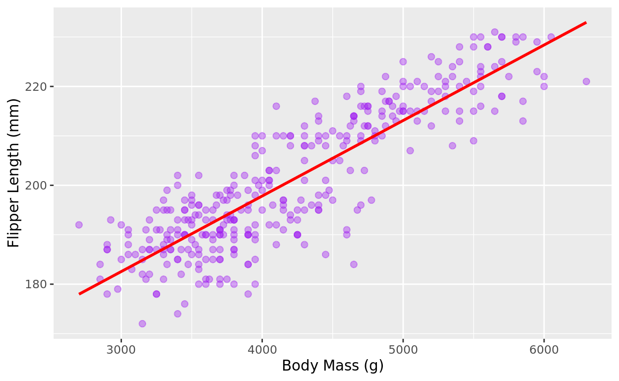
Re-ordering Categories
Alphabetical is default
By default, R will order non-numeric variables in alphabetical order.
For example, the species variable in the penguins dataframe from earlier lists the penguin species in alphabetical order
- Biscoe, Dream, Torgersen
ggplot(data = penguins, aes(x = island, fill = species)) +
  geom_bar(color = "black") +
  labs(x = "Island", fill = "Species", title = "Species Representation by Island")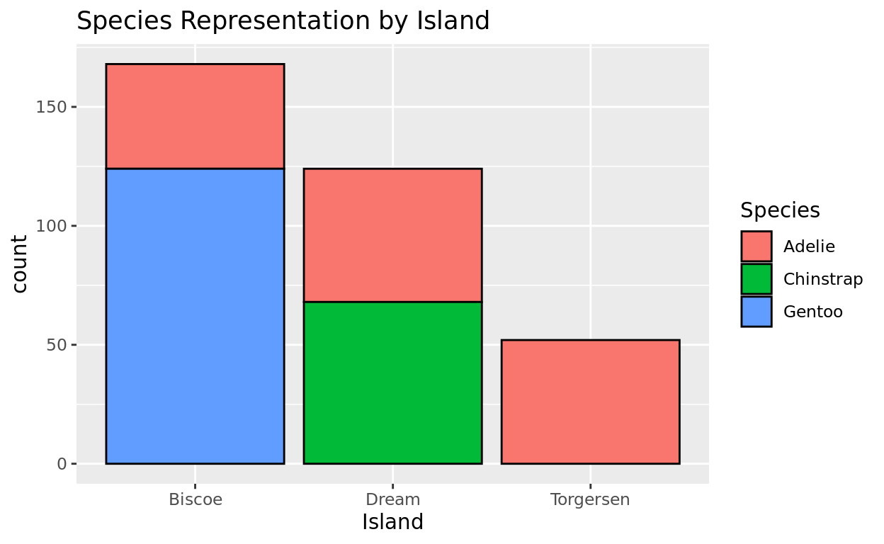
Re-ordering with factor
But perhaps we want to have these islands list in a different order–perhaps by geography or perhaps by counts from fewest to most penguins.
We can use the factor function to redefine its structure. This function takes two arguments
- the vector that you wish to restructure
levels, which will be your custom ordering of values
factor(penguins$island, levels = c("Torgersen", "Dream", "Biscoe"))
How to apply it
To apply it, we just need to assign this factor ordering back to the original variable in the data frame. Notice below how this factor structuring is set equal to the variable island through the data frame penguins.
Notice that this code doesn’t output anything. It is an internal restructuring.
penguins$island = factor(penguins$island, levels = c("Torgersen", "Dream", "Biscoe"))Now lets try the plot
If we now try the plot, you’ll see how the levels have been restructured!
penguins$island = factor(penguins$island, levels = c("Torgersen", "Dream", "Biscoe"))

ggplot(data = penguins, aes(x = island, fill = species)) +
  geom_bar(color = "black") +
  labs(x = "Island", fill = "Species", title = "Species Representation by Island")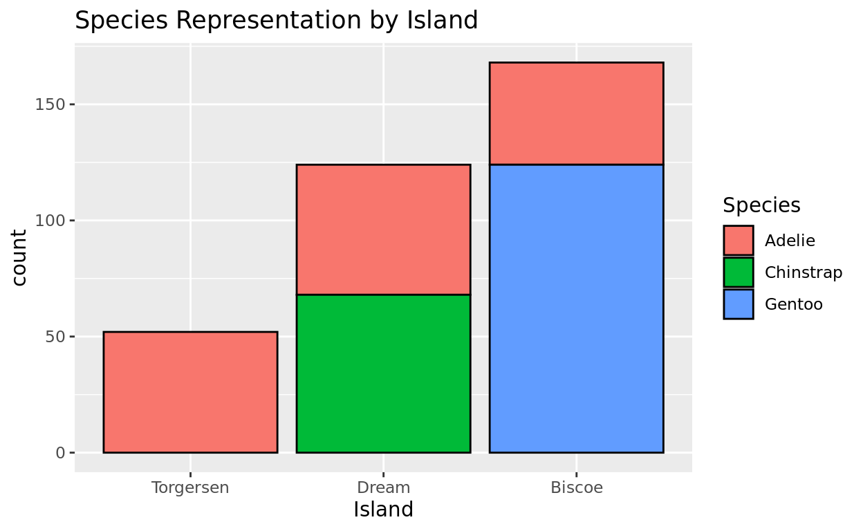
Another example
Consider this datam frame with 28 high school students
ClassI want to make a plot to compare them based on their class level.
ggplot(data = Class, aes(x = acad_level, y = height, color = acad_level)) +
  geom_jitter(width = 0.08) +
  labs(title = "Class Heights by Year",
       x = "Academic Level",
       y = "Height (in)",
       color = "Academic Level")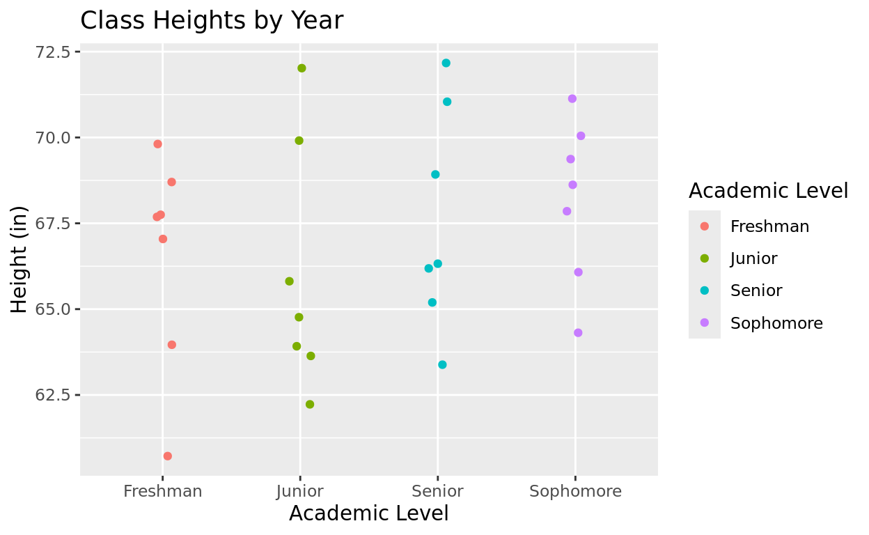
Re-order
But notice that alphabetically, my order of academic level is Freshman, Junior, Senior, Sophomore.
I’d like to get the order to be chronological: Freshman, Sophomore, Junior, Senior!
Think of my coding template as follows…what would I fill in at each blank?
_______$_______ = factor(______$______, levels = c("Freshman", "Sophomore", "Junior", "Senior"))
Finished Example
Class$acad_level = factor(Class$acad_level, levels = c("Freshman", "Sophomore", "Junior", "Senior"))

ggplot(data = Class, aes(x = acad_level, y = height, color = acad_level)) +
  geom_jitter(width = 0.08) +
  labs(title = "Class Heights by Year",
       x = "Academic Level",
       y = "Height (in)",
       color = "Academic Level")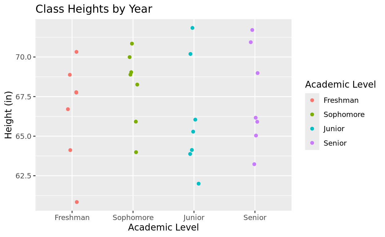
Be cArEfUl wItH cAsE!
Be super careful with these codes, as you’ll need every category name to be exactly as it appears in the data sheet, including CaSe SenSiTiVe. And make sure your data frame name matches what you have in your global environment!
Return Home
This tutorial was created by Kelly Findley, with assistance by Brandon Pazmino (UIUC ’21). We hope this experience was helpful for you!
If you’d like to go back to the tutorial home page, click here: https://stat212-learnr.stat.illinois.edu/