Visualizing with R
Goals
In this tutorial, we will cover the following:
- Introduce the
ggplot2package as a great resource for visualization functions inR - Learn to code Histograms and Density Curves as visualization options that explore the shape of a numeric variable
- Learn to code Barplots as a helpful way to visualize categorical data
- Learn to code Boxplots as a quick and efficient way to compare groups
- Learn to code Scatterplots as a way to visualize the relationship between two numeric variables
- Briefly talk about the options that await us with continued exploration of the
ggplot2package!
The Need for Visualization
Visualization is important both in the exploration and analysis phase (so we can better see what might be going on in data) and in the presentation phase (to share important insights with our audience).
Visualization will reveal patterns in the data that might not be as evident when only looking at numeric summaries!
Base R visualization
R as a language has many built-in functions for graphing (e.g., hist, plot). These are known as “base R” functions.
hist(prostate$age)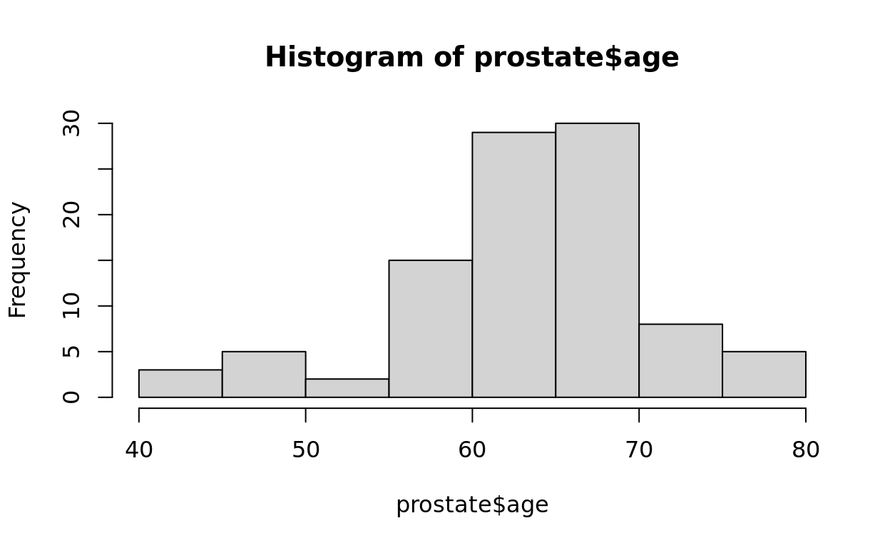
Limitations of Base R
Base R plots are great for quick and simple visualization, but they do have limitations.
As visualization tools have evolved tremendously in recent decades, many users find base R functions clunky and difficult to use for more complex visualizations. They instead turn to packages that are regularly updated for new features!
Introducing ggplot2
We will primarily use visualization functions from a package named ggplot2. The “gg” of `ggplot2 stands for “Grammar of Graphics” because of how this package outlines a framework for concisely describing and coding components of a graphics.
Histograms
Our first plot!
On this first panel, we’ll start with creating histograms–a great plot option for a single numeric variable. Let’s construct our plot piece by piece.
Specifying the data and variables
The first line will use the ggplot function. This function requires a data argument, followed by a mapping argument.
- The
dataargument specifies which data structure we are calling on - The
mappingargument specifies which variables we are mapping to the plot and how that variable will be represented in the plot.
ggplot(data = ..., mapping = ...)
Aesthetic
Note that for mapping, we identify the variables we are using inside an embedded function called aes (which stands for “aesthetic”).
ggplot(data = ..., mapping = aes(...))
Adding a geometry
Next, we can name a geometry (geom) to identify what form our plot will take. Since we are making a histogram, we will choose geom_histogram.
ggplot(data = ..., mapping = aes(...)) +
geom_histogram()
In context
Let’s use the prostate data that we have already seen, take the age variable plotted on the x axis, and choose histogram as our geometry. Run the following code to see what it looks like!
ggplot(data = prostate, mapping = aes(x = age)) +
  geom_histogram()
## `stat_bin()` using `bins = 30`. Pick better value `binwidth`.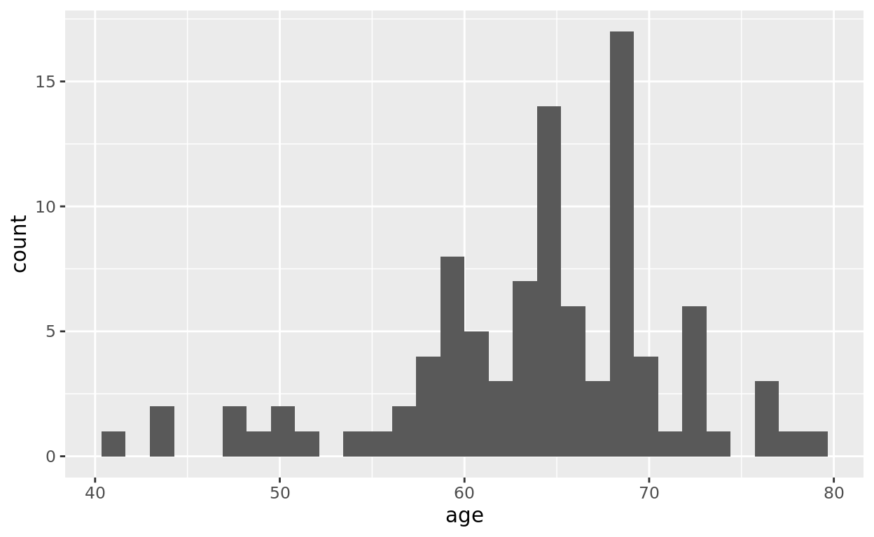
The + sign
We linked the ggplot line with the geometry line using a + sign. In ggplot commands, note that we will often link multiple commands together with +. Think of it as an “and” statement.
Add some color
We aren’t restricted to this dark, uninspiring color palette. We can change both the border color (activated by the color argument) and the fill color (activated by the fill argument).
Run the following ggplot to change the border color and fill color. Feel free to adjust the color options to other generic colors! (and yes, there is a very extensive list of color options we’ll see in a later tutorial!)
ggplot(data = prostate, mapping = aes(x = age)) +
  geom_histogram(color = "black", fill = "green")
To “Quote” or Not to Quote
If naming specific colors, be sure to write them in quotation marks. Quotation marks are often for identifying static entries.
Variable names should not be listed in quotation marks when mapped to a representation because they are dynamic entries!
Setting Number of Bins
While histograms in R will default to 30 bins if no selection is made, you might try playing around with the binwidth to find a good balance.
- Less data usually looks better with wider bins
- More data usually looks better with narrower bins
Change the binwidth and notice what happens!
ggplot(data = prostate, mapping = aes(x = age)) +
  geom_histogram(color = "black", fill = "green", binwidth = __)
Adding Labels
The labs function allows us to add a title, axes titles, and other labels as we wish. You don’t need to use all of these arguments though! Feel free to delete one or more of those arguments.
I also changed the colors just for fun and chose a binwidth of 2.
ggplot(data = prostate, mapping = aes(x = age)) +
  geom_histogram(color = "white", fill = "red", binwidth = 2) +
  labs(title = "Age of Respondents", x = "Age", y = "Count totals")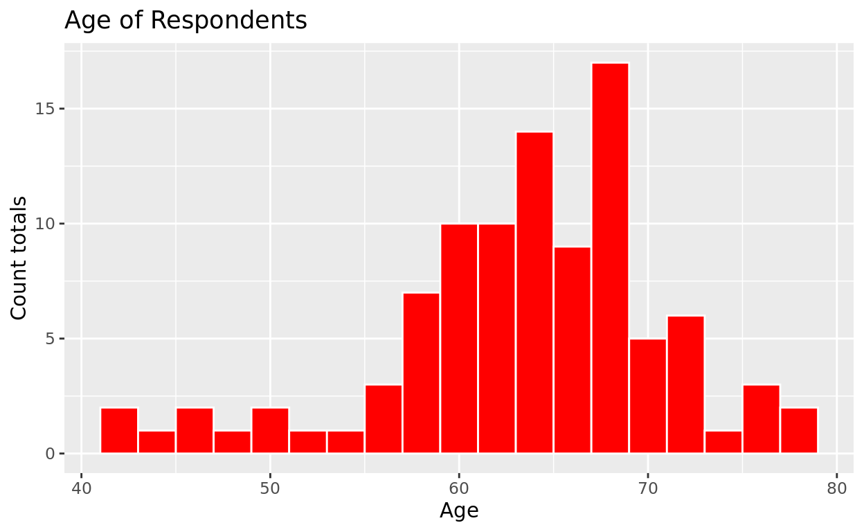
Labels in Quotations
Again, notice the use of quotation marks for Labels. These are static applications to your plot, as opposed to the dynamic application that comes from a variable mapping.
Code on your own
Fill in the blanks below to create a histogram! Use the diabetes dataset and use chol (short for “cholesterol”) as the variable you will be observing within your dataset.
- Set bin number to 20.
- Create a black borderline and a pink fill color
- Title your plot “Cholesterol Levels”
If you are struggling, click the “Hints” button to get some help. It will eventually take you to the solution if you need it, but try to figure it out on your own first!
ggplot(data = _________, mapping = aes(___________)) +
  geom_histogram(_________) +
  labs(____________)
ggplot(data = _________, mapping = aes(x = _________)) +
geom_histogram(fill = "pink", _________________) +
labs(title = "________")ggplot(data = diabetes, mapping = aes(x = _________)) +
geom_histogram(fill = "pink", color = "_______", bins = ___) +
labs(title = "________")ggplot(data = diabetes, mapping = aes(x = chol)) +
geom_histogram(fill = "pink", color = "black", bins = 20) +
labs(title = "Cholesterol Levels")Density Curves
Introducing Density Curves
Density curves with sample data will be like a smoothed version of a histogram.
If we don’t have much data, density curves might be misleading, as they smooth out the data to suggest a distribution shape. However, if we have a lot of data, density curves can be more helpful than histograms in revealing the general trend of that variable.
Anaesthetic Data
The anaesthetic dataset compares 4 different anaesthetics with 20 patients each and measures time in minutes until the patient can begin breathing unassisted after use.
library(faraway)
anaesthetic
Making a Density curve
The following density curve has its numeric x equal to time to breathe (the variable breath). We can again use fill to define a fill color and color to define a border color.
ggplot(data = anaesthetic, mapping = aes(x= breath)) +
  geom_density(fill = "purple", color = "black")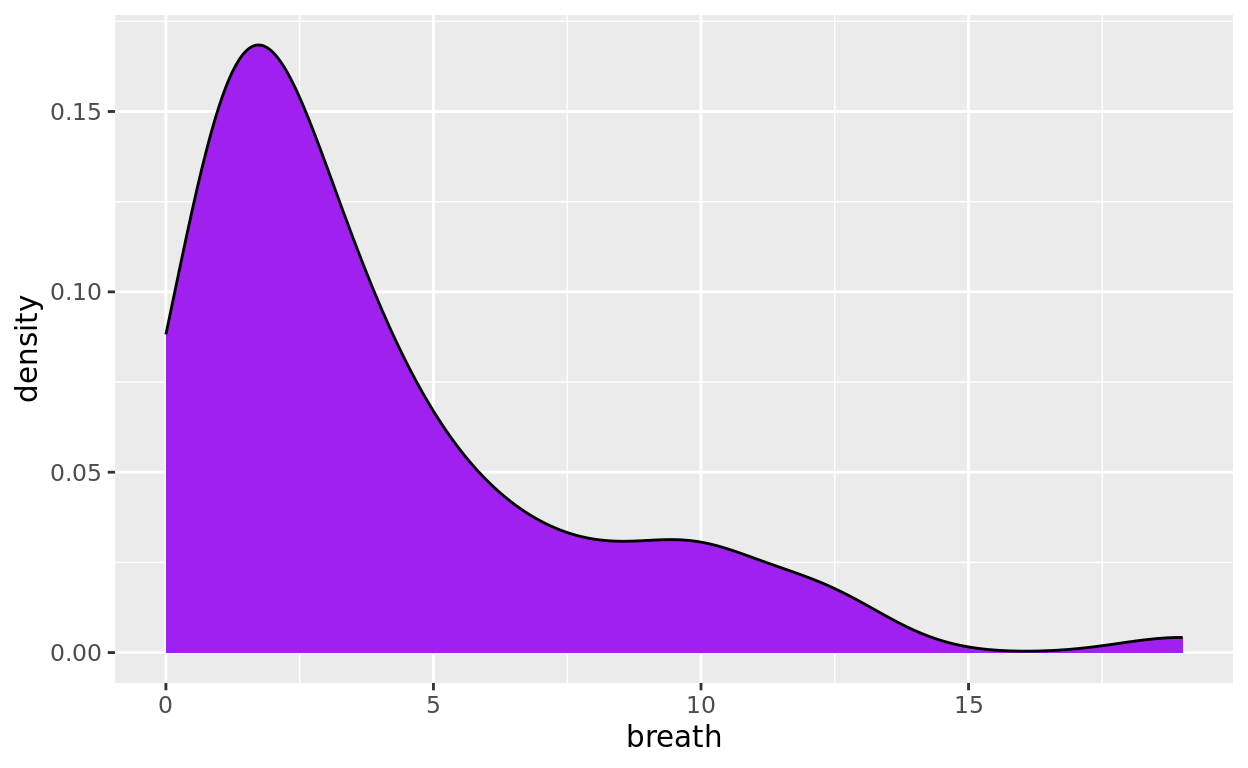
A Shorter Type
We talked about default order of arguments in the past, so let’s put it to use!
R will assume that your second argument with aes is the mapping = argument. So typically when writing ggplot code, you can just leave the mapping = part out!
ggplot(data = anaesthetic, aes(x= breath)) +
  geom_density(fill = "purple", color = "black")
You can also drop the data = as well (like below), but personally, I tend to type it out for clarity!
ggplot(anaesthetic, aes(x= breath)) +
  geom_density(fill = "purple", color = "black")
Alpha (transparency)
While not especially important on a univariate plot, it’s sometimes helpful to add transparency to your graph.
Alpha spans from 0 (fully transparent) to 1 (fully opaque).
Feel free to adjust alpha to different values to see what happens!
ggplot(data = anaesthetic, aes(x= breath)) +
  geom_density(fill = "purple", color = "black", alpha = 0.5)
But don’t we want to compare the anaesthetics?
The point of the data is to compare four different anaesthetics, but we just looked at the distribution of all four combined. We’ll return to this data at the end of this tutorial to make that comparison!
Barplots
Using Barplots
Barplots can help us visualize the distribution of categorical or discrete variables much the same way histograms do.
We will start with barplots for just one variable.
The Diamonds dataset
We will be using the diamond dataset (it’s inside the ggplot2 package). Notice that each row is a unique diamond, and each column represents a variable we’ve observed or measured about these diamonds.
library(ggplot2)
diamonds
How many diamonds of each cut
One variable of interest is the cut of the diamond (it’s a measure of quality). A barplot can help us quickly see how many diamonds of each cut we have in this dataset.
ggplot(data = diamonds, aes(x = cut)) +
  geom_bar(fill = "dodgerblue")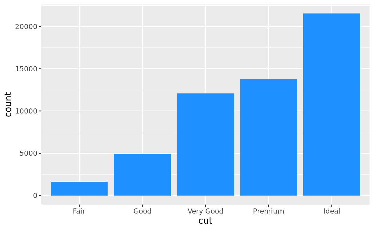
Coloring by a Variable
While we can color our barplot using a single block color, we can also color (or in this case, fill) by a variable. Notice in this next plot that we are also assigning the diamond’s cut to also be represented as a fill color!
ggplot(data = diamonds, aes(x = cut, fill = cut)) +
  geom_bar()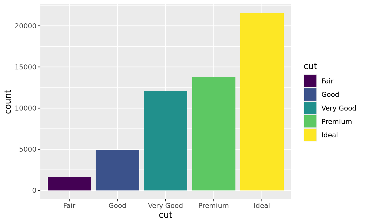
Notice a few things:
Several reminds and observation here
- Variable names are not put in quotation marks, since they represent dynamic entries rather than static entries
- We need to represent this in the aesthetic (aes) function since it is a variable representation.
- We do not also add a fill assignment in the
geom_barline, as that would overwrite the previous fill assignment. Feel free to try in the example above to see what happens!
Barplots using geom_col
In the previous example, each row represented one object (a diamond). But what if our unit of observation is already a summary?
Example with mtcars
We can see this with the mtcars dataset. This data (collected from the 1970s) has each vehicle model represented as one row.
mtcarsEach row as a bar?
Let’s say I wanted to make a barplot that compared each model’s mpg. In that case, I’m not counting how many vehicles there are in a category. Rather, each row will now have its own bar extending to the value shown in the mpg column.
Let’s try it!
Let’s assign the car model to the x-axis and the mpg variable to the y axis. For this situation where aren’t counting rows in each category but instead assigning a variable to y, then we will use the geom_col geometry.
FYI: mtcars is an unusual case data frame where the vehicle names are stored as rownames, rather than as their own variable. So in the plot below, I inputted rownames(mtcars) so that R can find the vehicle names and treat them like a variable. You do not need to know this extra bit!
ggplot(data = mtcars, aes(x = rownames(mtcars), y = mpg)) +
  geom_col(fill = "goldenrod")
Can you read that??
All of the vehicle names are overlapping! An easy fix is to change the orientation of the barplot itself.
Let’s switch which variable appears on the x axis and which is on the y axis.
ggplot(data = mtcars, aes(y = rownames(mtcars), x = mpg)) +
  geom_col(fill = "goldenrod")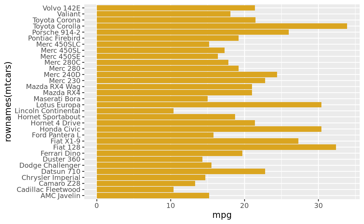
Penguins Dataset
For this practice, we will use the penguins dataset from the palmerpenguins package. This dataset records information from 3 different species of penguins.
library(palmerpenguins)
penguins
Try a Barplot
Create a barplot to count up and compare how many penguins we have from each species.
Make a choice! Do you want to have your bars extend vertically or horizontally? Which axis should you assign your categorical variable too in each case?
Color each bar differently by also assigning species as a fill color.
In addition to the barplot itself, create a title called “Penguins by Island” using the labs function at the end.
This practice has no checker, but you can use the hints to see a sample solution.
ggplot(data = ____________, aes(_______________)) +
  geom_bar() +
  labs(___________)
ggplot(data = penguins, aes(y = ___________, fill = _________)) +
geom_bar() +
labs(title = "_________________")ggplot(data = penguins, aes(y = species, fill = species)) +
geom_bar() +
labs(title = "Penguins by Species")Boxplots
Introducing Boxplots
Boxplots are a very commonly used to summarize a distribution. One drawback of boxplots is that they can’t show you…
- how many data points there are, or
- the shape of the distribution outside the quartiles.
An advantage of boxplots is that they are often cleaner than many other choices and very helpful for comparing groups!
Solo Boxplots
Let’s first create a boxplot of a numeric variable all by itself using the anaesthetic data.
ggplot(data = anaesthetic, aes(y = breath)) +
  geom_boxplot(fill = "red")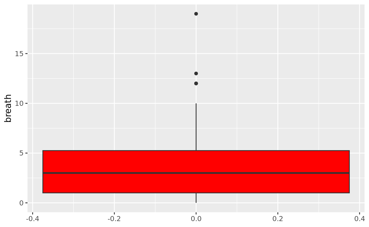
Is this even helpful?
R defaults to a certain graph size which makes solo boxplots look very unappealing (this can be fixed by defining a width argument, like below).
geom_boxplot(fill = "red", width = 0.5)
But in practice, boxplots are almost exclusively used to compare groups!
Side by side Boxplots
Let’s do this again, but let’s now compare the different anaesthetics with regard to how many breaths it takes someone to revive on their own completely. Take a look again at the data:
anaestheticLet’s keep breath on the y axis, but now split the x axis up by the anaesthetic used (that variable is coded as tgrp). This will now create a different vertical boxplot for each anaesthetic used.
ggplot(data = anaesthetic, aes(x = tgrp, y = breath)) +
  geom_boxplot(fill = "red")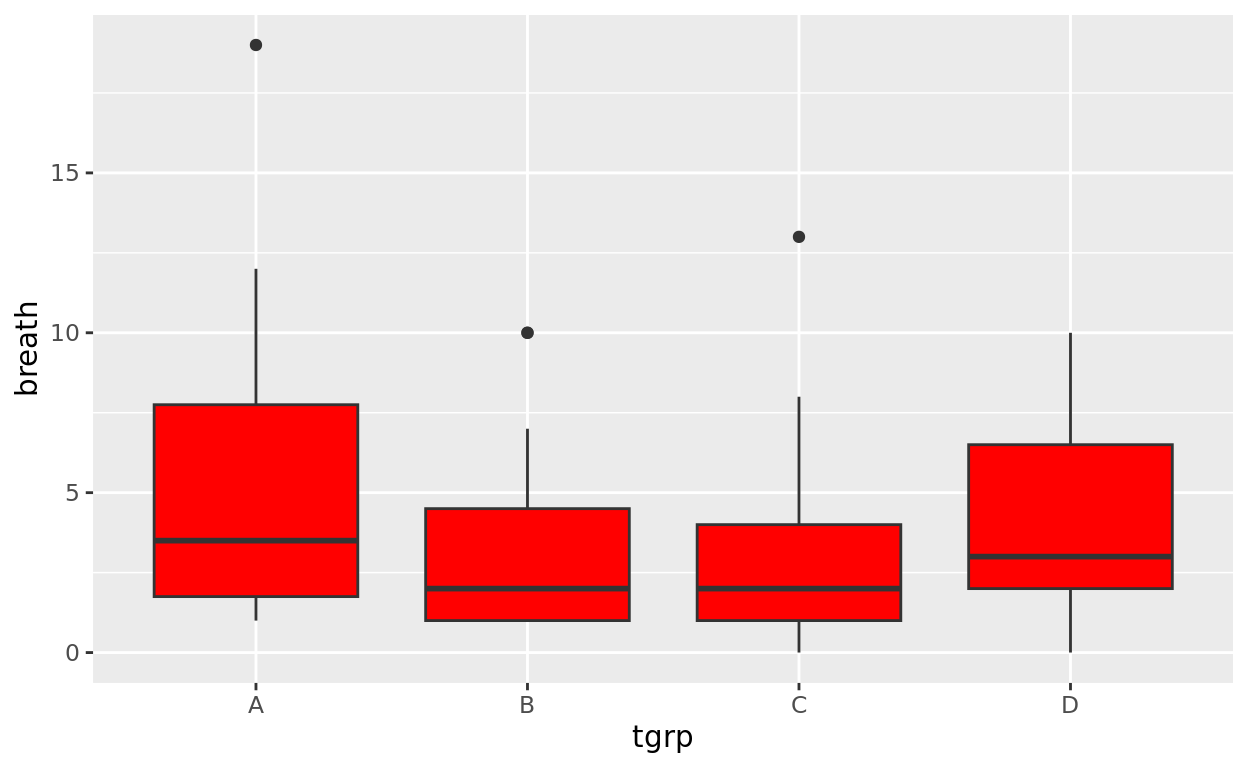
Orientation and Color options
If preferred, we can change the orientation like we did for barplots!
We can also change each box to a different color if we wish by adding a fill argument.
ggplot(data = anaesthetic, aes(y = tgrp, x = breath, fill = tgrp)) +
  geom_boxplot()
Whiskers
We can optionally add errorbars to the whiskers by adding another layer: stat_boxplot() and setting geom = "errorbar"
ggplot(data = anaesthetic, aes(y = tgrp, x = breath, fill = tgrp)) +
  geom_boxplot() +
  stat_boxplot(geom = "errorbar")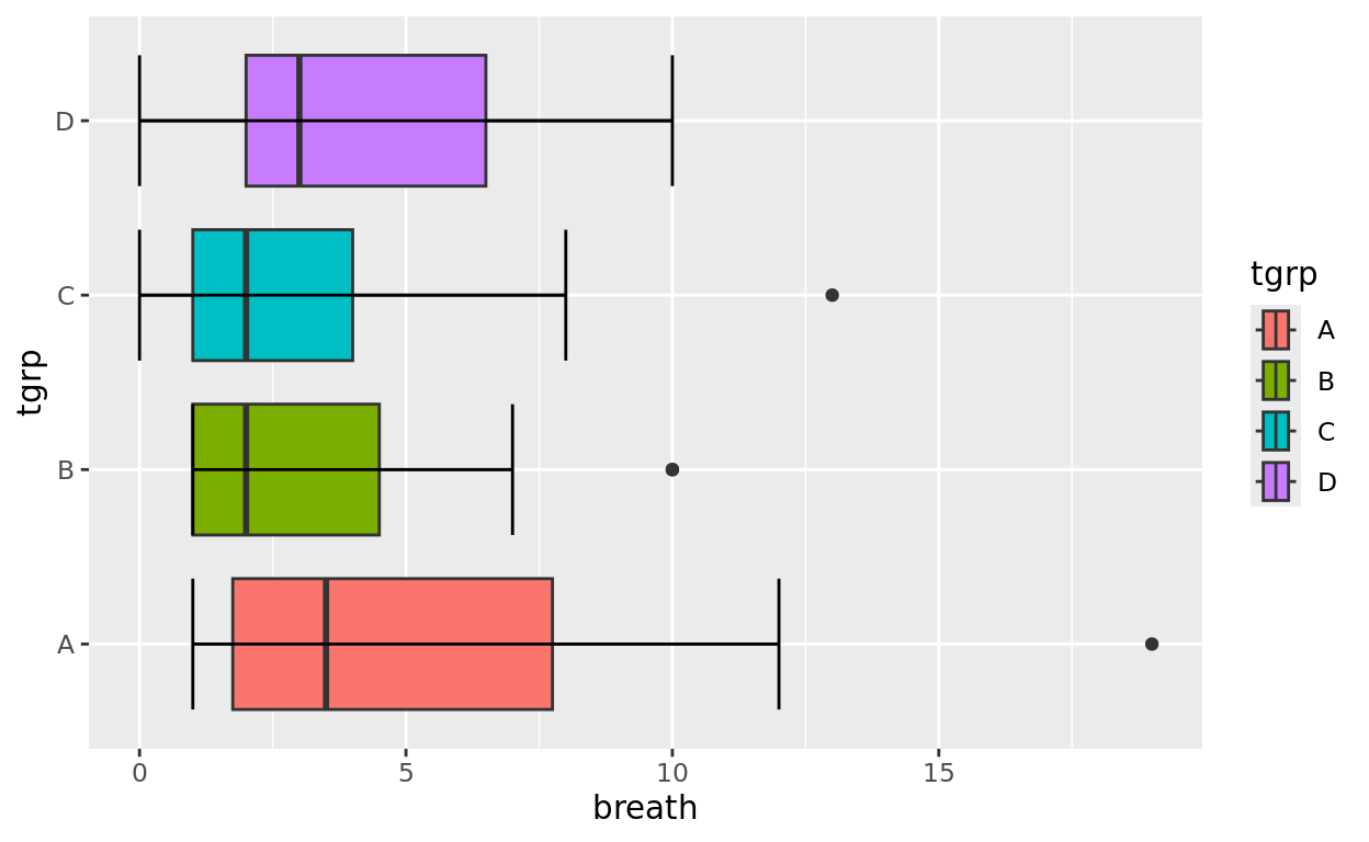
Observations
So, is there a difference between the anaesthetics?
Later in the course, we’ll learn how to determine probabilistically if the anaesthetics could be the same, or if this distributions are different enough to suggest underlying differences!
Try your own!
Let’s return to the penguins dataset once again.
library(palmerpenguins)
penguins- Create side by side boxplots comparing
body_mass_gof eachspecies - Make each of your bars different colors (as we did above) by setting your categorical variable as the fill option.
- Add whiskers (i.e., errorbars)
- Give it the following title: “Body Mass (g) by Species”
ggplot(data = _____, aes(___________)) +
  geom_boxplot()
  stat_boxplot(______________) +
    labs(______________)
ggplot(data = penguins, aes(x = _____ , y = _____, fill = ____)) +
geom_boxplot()
stat_boxplot(geom = "__________") +
labs(_______________)ggplot(data = penguins, aes(x = species , y = body_mass_g, fill = species)) +
geom_boxplot() +
stat_boxplot(geom = "errorbar") +
labs(title = "Body Mass (g) by Species")Scatterplots
Introduction
Scatterplots are helpful for looking at the potential relationship between two numeric variables.
Prostate Cancer data
Let’s take a look at the prostate data from the package faraway. This data records information about 97 men who have been diagnosed with prostate cancer.
library(faraway)
prostate
First Scatterplot
Is there a relationship between the prostate weight (lweight) and the volume of cancer (lcavol) in this group?
We’ll use the geom_point option again…but this time with two numeric variables, we’ll get points scattered across the plane instead of column groupings!
ggplot(data = prostate, aes(x = lweight, y = lcavol)) +
  geom_point() +
  labs(title = "Predicting Cancer Volume by Prostate Weight", x = "Prostate Weight", y = "Cancer Volume")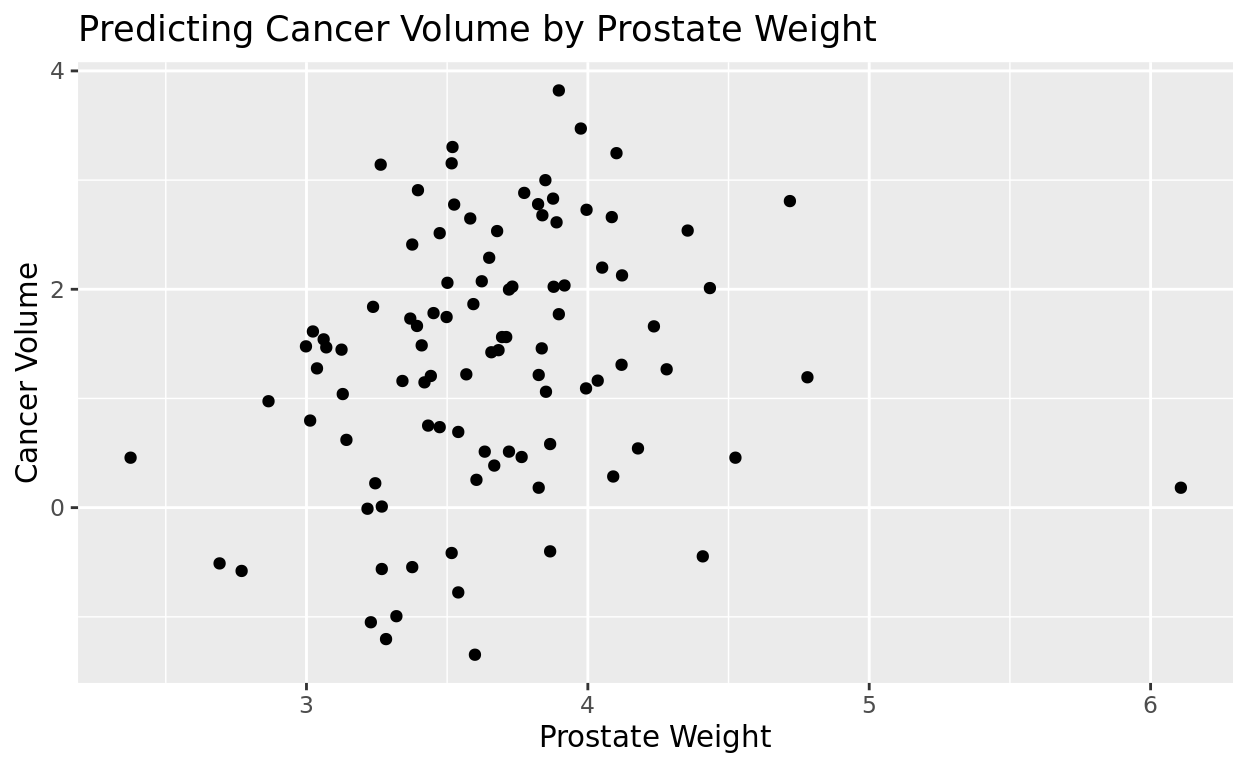
Splitting arguments across multiple lines
Our labs line is getting pretty long. After each comma, it’s comma to put each new argument on a new line to make it easier to read. We’ll do that for the rest of these plots.
ggplot(data = prostate, aes(x = lweight, y = lcavol)) +
  geom_point() +
  labs(title = "Predicting Cancer Volume by Prostate Weight",
       x = "Prostate Weight",
       y = "Cancer Volume")
Add a singular color
If we don’t want to go with the generic black, we can also add a singular color option in geom_point(). Notice again that with points, it needs to be color = rather than fill =. It’s easy to mix that up, so try to remember that with points!
ggplot(data = prostate, aes(x = lweight, y = lcavol)) +
  geom_point(color = "dodgerblue") +
  labs(title = "Predicting Cancer Volume by Prostate Weight",
       x = "Prostate Weight",
       y = "Cancer Volume")
Alpha (transparency) + Dot Size
You can also change the level of transparency within your scatterplot which is denoted by alpha
- Alpha spans from 0 (fully transparent) to 1 (fully opaque)
- Changing this value can help us reveal more of the density of the data when it is heavily clustered
- Probably not necessary here, but it comes in handy when working with larger datasets!
Likewise, we can also adjust the size of the dots with the size argument in geom_point
ggplot(data = prostate, aes(x = lweight, y = lcavol)) +
  geom_point(color = "dodgerblue",
             alpha = 0.5,
             size = 2) +
  labs(title = "Predicting Cancer Volume by Prostate Weight",
       x = "Prostate Weight",
       y = "Cancer Volume")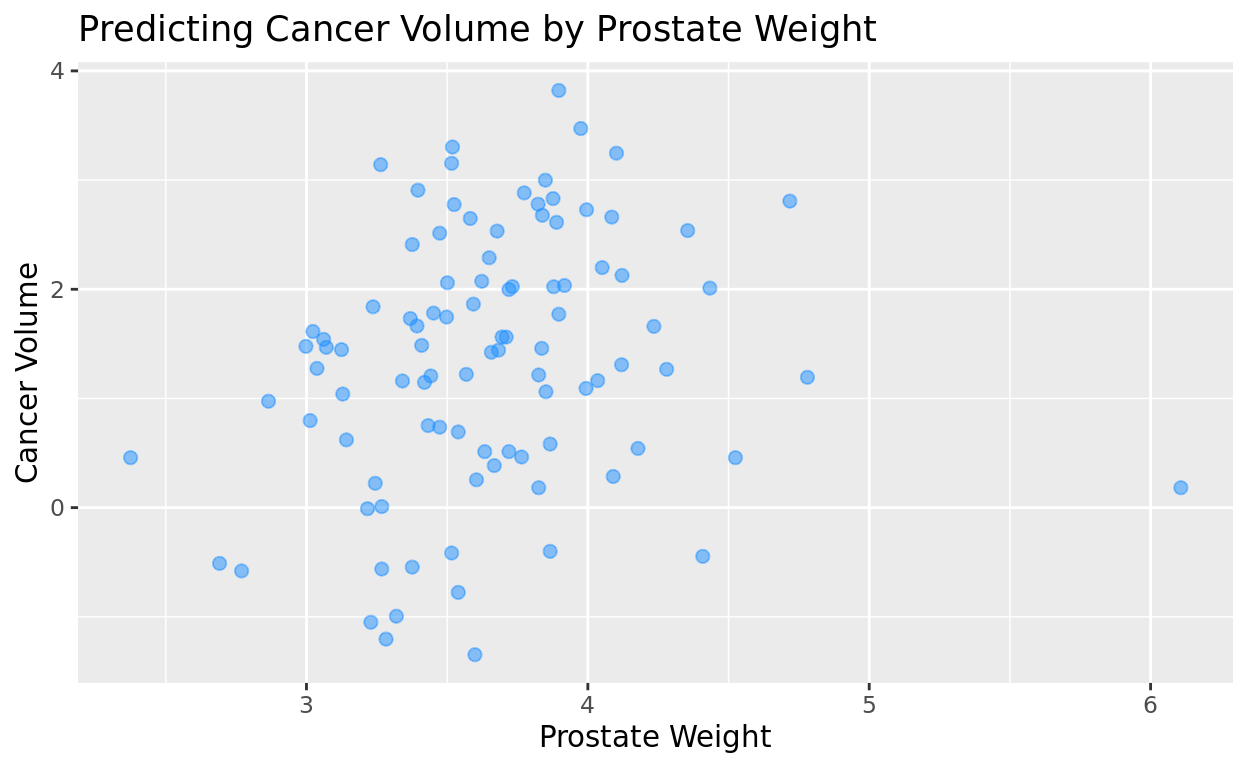
Closing Things
The R Graph Gallery
We’ll learn many more features and geometries in this course, but you might also find the R gallery interesting for some previews of what’s possible: https://www.r-graph-gallery.com/
Return Home
This tutorial was created by Kelly Findley and Brandon Pazmino (UIUC ’21). We hope this experience was helpful for you!
If you’d like to go back to the tutorial home page, click here: https://stat212-learnr.stat.illinois.edu/